In this guide
Travel is bought on trust and imagination. A visitor cannot touch the product, so the website has to show what a trip, a flight or a course will be like, state exactly what it costs and includes, and make the step from "interested" to "booked" feel safe. A travel company website that does those three things well can be quite simple; one that skips them will lose people however good the photography is.
What do visitors to a travel or leisure website come to do?
The three kinds of business in this guide, a tour company, an airline-style brand and a dive school, share one pattern. Visitors move from inspiration to comparison to a decision, and each stage needs a different page.
- Get inspired. They look at destinations, routes or dive sites to see what is possible. Strong imagery and a short, vivid description do the work.
- Compare options. Trip length, pace, price per person, cabin and fare type, course length and level. They want a table, not a paragraph.
- Check the details. What is included, what is extra, how bags, transfers or equipment work, what the cancellation terms are.
- Judge the operator. Who are you, how long have you done this, how do you plan, and who can I talk to?
- Act. Send an enquiry, build a quote, check a fare, or book a course day.
People leave when prices are missing, when itineraries are a wall of text, when they cannot tell whether an extra cost is coming, or when the booking step suddenly asks for a lot of personal information with no explanation.
What is the page and section map for a travel site?
The table below covers all three business types. Pick the rows that match yours.
| Page | Purpose | Key elements |
|---|---|---|
| Home | Inspire and direct | One strong visual idea, a short promise, entry points to destinations, routes or courses, a visible enquiry or booking button |
| Destinations, routes or dive sites | Let people explore | Cards with a place, duration or flight time, a from-price, and pace, level or season |
| Itinerary, route or course page | Make the product concrete | Day-by-day plan or syllabus, inclusions and exclusions, price basis, dates, what to bring, enquiry form |
| Trip styles, cabins or packages | Help choose | Family, honeymoon, adventure; or Economy, Premium, Business; or a bundle of courses |
| Planner, fare calculator or cost estimator | Make the price tangible | A few inputs, a clear breakdown, an estimate label and a next step |
| How we plan or how a course works | Reduce uncertainty | Steps from first contact to the trip, who does what, what you will be asked |
| Safety, accessibility and policies | Build trust | Plain-language terms, accessibility information, health and fitness notes for activities |
| About, team and instructors | Show the people | Real names, roles and experience you can state truthfully |
| Guides and journal | Earn search visits | Packing lists, seasonal advice, baggage rules, written from real experience |
| Contact and manage booking | Support | Phone, WhatsApp, form, hours, and a way to change or check a booking where you offer it |
How do you write an itinerary page that sells?
An itinerary page is the product page of a tour company. A visitor should understand the trip in one scroll and know what to do next:
- A headline that names the place and the length, followed by one sentence on the feel of the trip.
- Key facts at the top: nights, the pace, the group size, the season, and the price basis such as "from, per person, twin sharing".
- A day-by-day outline, short and scannable, with the sleeping place and main activity for each day.
- A clear "included" and "not included" list, because hidden extras are the main source of distrust.
- A map or route graphic that shows how the days connect.
- One enquiry form on the same page, pre-filled with the trip name.
The same structure works for a dive course: replace days with sessions, replace the route with the training steps, and show the level, depth range and prerequisites. For deeper operational detail on building itineraries behind the scenes, see our guide to travel agency software for itineraries and quotes.
Should visitors book online or send an enquiry?
It depends on how much of your product is fixed. Choose the lightest model that honestly fits.
| Model | Best for | What the site must do |
|---|---|---|
| Enquiry form | Custom trips, groups, high-value tours | Capture dates, party size and interests; promise a human reply and keep that promise |
| Quote builder | Tours that can be priced from a few choices | Return an estimate with its assumptions, then hand off to a person to confirm |
| Fixed-date booking | Courses, day trips, scheduled departures | Show availability, price and policy, then take a deposit through a payment provider |
| Full online booking | Airline-style fares and inventory | Needs a real booking system behind it, which is a larger project than a marketing site |
A marketing website can show routes, fares and calculators beautifully, but live seat inventory and payments need a booking engine integrated behind the scenes. Decide this before design, so no page promises something the business cannot deliver. If you take scheduled bookings with reminders, the online booking page guide is a useful companion.
A fare or trip estimate, made transparent
Calculators help when they show their working. The numbers below are invented for illustration. Taxes and fees depend on the rules that apply, so a real tool should say to check the current rules and label everything as an estimate.
| Line (made up) | Amount |
|---|---|
| Base fare | ₹4,000 |
| Taxes and fees | ₹600 |
| Checked bag | ₹500 |
| Seat selection | ₹300 |
| Estimated total | ₹5,400 |
The sum is 4,000 + 600 + 500 + 300 = 5,400. A visitor who sees each line is far more likely to trust the total.
How do you build trust on a travel website?
- Be specific about price. State what the price covers, per person or per group, and what is extra.
- Publish your terms. Cancellation, changes, refunds and payment steps in plain language, linked from every booking step. Check the current rules that apply to your type of business and region.
- Show the people. Planners, guides or instructors with real names and honest descriptions of their experience.
- Explain how you plan. A short page on what happens after an enquiry removes a lot of hesitation.
- Use real reviews only. Quote customers with their permission, and never invent or edit them.
- Add an accessibility page. Say what you can and cannot accommodate, and how to ask.
- For activities with risk, such as diving, publish safety, fitness and health information written with qualified people, and state clearly that the website is not medical or safety advice.
- Make contact easy. A phone number that can be tapped, WhatsApp, a real address and working hours.
Tip
Do not claim licences, memberships, training-agency affiliations or safety records you cannot show. If you hold them, name them exactly and link to the issuing body so visitors can verify.
What content should you prepare before design starts?
- A list of destinations, routes, courses or sites, each with duration, pace or level, and a from-price you can honour.
- Itinerary outlines or syllabi, with inclusions and exclusions written once and reused.
- Photographs you own or have licensed, for each place and each activity. Label illustrations as illustrations.
- Policies: payment, cancellation, changes, baggage or equipment, age and fitness requirements.
- Team and instructor details, with permission to publish names and photographs.
- A seasonal calendar: the best months, departure dates or course dates.
- Any registrations, licences or disclaimers your sector requires. Rules vary by country and change over time, so check the current rules.
How can 3D and motion help or hurt a travel website?
Travel is about place and movement, which makes it a natural home for motion. A globe that follows a route, a sky that changes as you climb or water that deepens as you scroll can create the feeling of the journey before the visitor has read a word.
The drawbacks are worth stating plainly. A full-screen 3D scene is heavy for a phone, which is where many travel searches happen, often on slower mobile connections. Scroll-driven stories can frustrate a visitor who simply wants prices. Fast, repeated motion can make some people feel unwell. So:
- Keep itineraries, prices, fares and policies as ordinary text that loads first.
- Respect the visitor's reduced-motion setting and provide a still version.
- Lower the visual quality on modest devices, and test on one.
- Never let a scene hide the enquiry button or slow the booking form.
Use motion to introduce the place; use plain pages to sell the product. Our overview of website trends for 2026 puts this in context.
Mobile-first notes for travel and leisure sites
- Cards that swipe. Destinations, routes and courses suit a horizontal rail with a "see all" link.
- Tables that fit. Fare and package comparisons should scroll within their own frame or restack into cards on narrow screens.
- Date and traveller pickers with large targets, at least 44px, and numeric keyboards for counts.
- Short forms. Name, phone or email, dates, party size. Use 16px inputs, which avoids zoom-on-focus.
- Thumb-reachable actions. Keep "Enquire" or "Book" in a bar at the bottom of the screen on itinerary and course pages.
- Currency that follows the visitor. Offer a clear selector and label converted amounts as approximate.
Basic search visibility for tour, airline and dive brands
Travel searches are specific: a place, a season, a type of trip or a course name. Give each destination, route and course its own page with a clear title and h1, write meta descriptions that say what the trip or course is, and publish guides that answer real questions such as what to pack or how baggage works. Keep your name, address and phone consistent everywhere, add descriptive alt text to photographs, and compress images so pages load quickly. None of this promises a position in results, but it removes the common obstacles. A broader introduction is in why every business needs a modern website.
The travel and leisure demos
Zenocta built three working demo websites for this sector. All are fictional brands with sample content: destinations, routes, courses and prices are samples, and nothing can be booked.
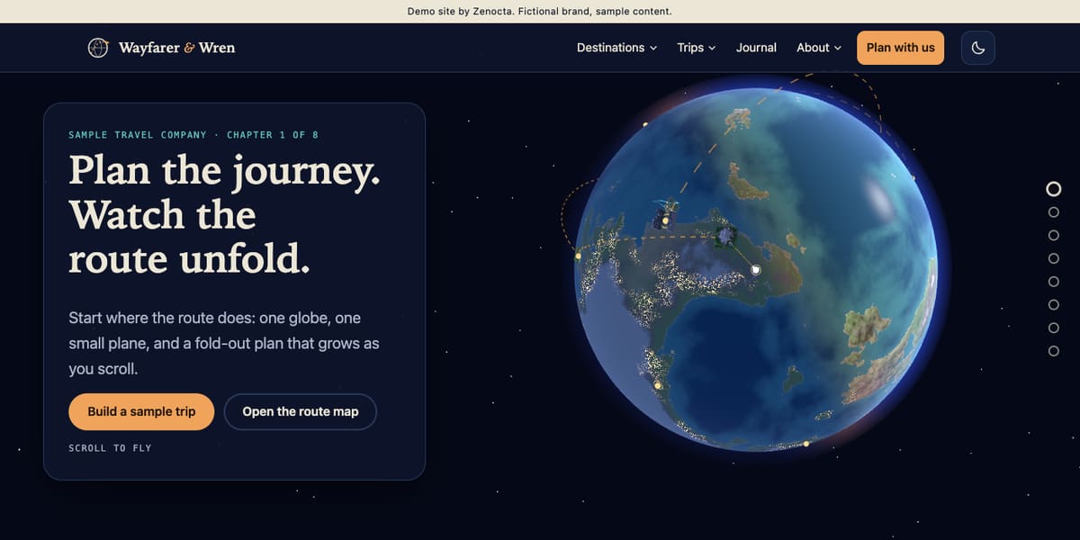
Wayfarer & Wren Journeys: a tour company on a globe
A procedural 3D globe with flight arcs opens an eight-chapter scroll, with a landscape scene for each of the sample destinations. Ten destination pages show nights, a from-price per person and the pace, plus a sample itinerary. A trip builder lets you choose a place, nights and travellers and draws your own route, and there are a route map, a seasonal planner, trip styles, packages, group trips, guides, a how-we-plan page and an accessibility page. Open the Wayfarer & Wren demo.
Cirrusway Air: an airline-style brand in the clouds
The sky behind the page is rendered live and the camera climbs through cloud layers from dawn to night as you scroll. Ten sample routes each have a page with their own time of day, and the site compares Economy, Premium and Business cabins as seat maps and lays out Saver, Flex and Flex Plus fares in plain rows. A fare calculator breaks a total into base fare, taxes, bags and extras in your currency, and there are a baggage and travel guide, a loyalty page, sample flight status and a manage-booking page. Open the Cirrusway Air demo.
Halocline Dive Academy: courses and sites underwater
You sink from the surface through light, reef, kelp, wall and wreck while fish flock around your pointer. Behind it sit five course pages, packages, a how-a-course-works page, dive site pages that show level and depth range, a trip calendar, a course finder, a trip cost estimator, a gear guide, an instructors page and a safety and fitness FAQ. The demo states that it is not safety or medical advice, a pattern worth copying. Open the Halocline Dive Academy demo.
From idea to launch: how a travel website comes together
- Decide how people will act. Enquiry, quote, scheduled booking or full online booking. Be honest about what systems exist.
- Define the page map. Start with destinations or courses, itinerary pages and policies.
- Collect content and policies. Itineraries, inclusions, photographs and terms in writing.
- Review the design on a phone. Approve phone layouts before desktop ones.
- Build and connect. Wire up forms, calculators, currency display and any payment or booking tool, then test each path.
- Test and launch. Check pages at several screen widths and on a modest phone, then publish.
A focused site can be live in as little as 7 days. What moves it is the number of pages, features such as planners and calculators, integrations with booking or payment tools, and how soon your content arrives. A site that needs a live booking engine is a larger project and is scoped separately. Builds start from ₹8,888 in India and US$99 internationally, with the final price depending on scope, and domain and hosting are billed separately. See the pricing page for what drives cost.
How to start
Open the three demos, note what you would copy, and read about our website development service. Then contact us for a scoped, fixed-price proposal, or explore all sectors in the demo websites library.
Try it live
Open the real thing: demos run in a new tab with sample data, apps link to their own page.
 Live demoWayfarer & Wren demoA 3D globe journey, ten sample destination pages and a trip builder that draws your route.
 Live demoCirrusway Air demoA live cloud flythrough with sample routes, cabins, fares and a fare calculator.
 Live demoHalocline Dive Academy demoSink through an underwater scene to course pages, dive sites and a trip cost estimator.
- ABrowse allAll demo websitesBrowse working demo sites for thirty-six sample businesses.
- PBrowse allPricingWhat a website costs and what moves the price.
- TBrowse allTalk about your siteTell us about your trips or courses and get a scoped, fixed-price proposal.
Frequently asked questions
01What should a travel company website include?
Destination pages, detailed itinerary pages with inclusions and exclusions, clear from-prices, trip styles or packages, a planner or enquiry form, your terms and policies, team details and a how-we-plan page. Add guides and a journal for search visibility.
02Does a travel website need online booking?
Not always. Custom trips usually suit an enquiry form or a quote builder, while courses and scheduled departures suit fixed-date booking with a deposit. Live inventory and payments need a booking system behind the site, which is a larger project that is scoped separately.
03How do I build trust on a dive school or adventure website?
Show real instructors, explain how a course works, publish safety and fitness information written with qualified people, and state that the website is not safety or medical advice. Only claim affiliations you can show, and link to the issuing body.
04Is a 3D travel website practical on phones?
It can be, with care. Keep prices and itineraries as plain text, lower the scene quality on modest devices, respect reduced-motion settings and test on a mid-range phone. Use 3D to introduce the place, not to hold the information.
05How long does it take to build a travel website?
A focused site can go live in as little as 7 days. The timeline grows with pages, planners and calculators, integrations with booking or payment tools, and how quickly you supply itineraries, photographs and policies. Zenocta confirms it in a written, fixed-price proposal.