In this guide
A parent choosing a school, or a student picking a coaching institute, is making a decision that lasts years. They will read your site slowly, usually at night and often on a phone, and they are looking for reasons to trust you. A school website that answers the practical questions plainly, such as what is taught, who teaches, what it costs and how to apply, earns that trust faster than any slogan. This guide covers what a website for a school, coaching institute or learning business should include and how to plan it.
What do parents and students look for on a school or coaching website?
Parents and students are different audiences with overlapping needs. Parents ask "is it safe, is it right for my child, can I afford it". Students ask "what will I learn, how is it taught, what does a week look like".
- What is offered. Classes, streams, courses, batches and age groups, in plain words.
- Who teaches. Names, subjects and background, written accurately, with a real photo where the teacher agrees.
- What it costs. Fees laid out clearly, with what is included and what is extra, and how payment works.
- How to apply or join. Dates, eligibility, documents, and a simple first step such as an enquiry or a demo class.
- What daily life looks like. Campus, timetable, facilities, activities and how the school communicates with parents.
- How to reach a person. A phone number that is answered, a visit option and a real address.
They leave when fees are hidden, when pages are out of date, when results are claimed without evidence, or when the site is slow and cluttered on a phone. For a wider look at why a clear online presence matters, see why every business needs a modern website.
What pages should a school or coaching website have?
A small play school can work with eight pages. A school with several streams, or an academy with many courses, needs a clear structure so visitors never feel lost.
| Page | Purpose | Key elements |
|---|---|---|
| Home | Say who you serve and what makes your approach clear | Plain headline, an image of the real place, key programmes, admissions or enquiry button |
| About | Explain your approach and values | Story, teaching approach, leadership, how you communicate with parents |
| Programmes or courses | Help families choose the right fit | One page per programme or stage, age or eligibility, duration, who it suits, schedule |
| Admissions or enrolment | Turn interest into an application | Steps, dates, documents needed, enquiry form, contact person |
| Fees | Be transparent | Clear table, inclusions, extras, payment options, currency choice where relevant |
| Faculty or team | Build trust | Names, subjects, short bios written accurately |
| Campus, facilities or gallery | Show the place | Photos of classrooms, labs, play areas, safety features, accessibility details |
| Events and calendar | Show life at the school | Dated events, holidays, exam or batch dates |
| Journal or blog | Share useful guidance | Study tips, parent guides, announcements |
| FAQ, policies and contact | Remove doubts | Common questions, privacy, terms, map, hours, phone |
Which conversion elements suit education?
The goal is rarely an instant purchase. It is a visit, a call, a demo class or an application. Match the action to the size of the decision.
- A clear "admissions", "enquire" or "book a demo class" button in the header, repeated in the same words across the site.
- An enquiry form with the child's age or the student's target course, a phone number and a good time to call.
- A visit or campus tour request, because parents want to see the place before they commit.
- A fee table that is easy to read and honest about extras, with a "talk to admissions" option for scholarships or special cases if you offer them.
- A batch or timetable view for coaching, so students can see timings before they ask.
- A sample test, trial class or practice resource that lets a student try the style of teaching.
- A WhatsApp or phone option for parents who prefer a conversation.
- A consent line and privacy link near any form, especially where a child's details are involved.
What content should you prepare before design starts?
Schools and institutes often have the content already, scattered across brochures, circulars and WhatsApp messages. The work is to gather it and agree who approves it.
- A description of every programme, class level, stream or course, with age or eligibility and duration.
- The fee structure, inclusions, extras and payment schedule, approved by management.
- Admissions steps, dates and the documents families must bring.
- Teacher and leadership details, with consent for photos and names.
- Photos of the campus, classrooms and activities. Where children appear, get written permission from parents.
- Timetables, batch timings, holiday and event calendars.
- Any results or achievements you plan to publish, with the evidence behind each. Check the current rules for advertising results or rankings in your region and publish only what you can prove.
- Policies: privacy, safety, accessibility, refunds and terms.
- Logo files, brand colours and fonts.
Tip
If you cannot prove a claim with a document today, leave it out. A site that describes its teaching approach and shows its real classrooms honestly will be believed more than one that lists big promises it cannot back up.
How can motion and 3D help or hurt an education site?
Education has a natural fit for 3D: a campus you can explore, a planet you can turn, a surface you can reshape, an instrument whose sound you can see. Done well, it makes abstract subjects feel approachable and shows that a school or institute cares about how people learn.
- Teach, do not decorate. Motion works best when it explains the subject: a geometric surface that morphs for a maths coaching site, an orbiting galaxy for a science centre.
- Keep information plain. Fees, admissions dates and contact details stay in ordinary text so a parent can find them in seconds.
- Be careful with sound. If a music academy plays audio, it should start only when the visitor presses a button.
- Respect accessibility. Honour the reduced-motion setting, keep strong contrast, and make sure the site works with a keyboard.
- Watch performance. Many families use mid-range phones and variable connections. If the scene is heavy, the page must still be readable before it loads.
- Keep age in mind. For a preschool, playful scenes suit the audience, but the parent reading the page still needs clarity first.
What are the mobile-first rules for school and coaching sites?
Parents often read an admissions page on a phone, sometimes while waiting outside the school gate. Students browse courses on theirs. The phone version is not a smaller copy: it is the main site.
- Put a tap-to-call number and the admissions or demo-class button where a thumb reaches.
- Make every tap target at least 44 pixels, and use 16 pixel form fields so the page does not zoom.
- Show fee tables in a layout that fits a narrow screen, not a wide table that scrolls sideways.
- Show batch and timetable information as stacked cards on phones.
- Keep text at a readable size, and use contrast that works in bright light.
- Compress images so galleries do not use up a family's data allowance.
How do you get basic search visibility for a school or institute?
Families search for things like "play school near me", "coaching institute for entrance exams" or "music classes for children". Nobody can promise a ranking, but clear structure helps search engines and visitors alike. Our post on website speed, SEO and customer experience explains why fast pages matter.
- A clear title and heading on each programme page that says what it is and who it is for.
- Your name, address and phone number written the same way on the site and in your map listing.
- Fees, dates and timetables as real text, not images or scanned circulars.
- Separate pages for each course, stream or age group, so each can be found on its own.
- Descriptions on images and a fast, mobile-friendly layout.
Rankings also depend on reviews and competition. The website provides the foundation, not a position.
The education and learning demos
Zenocta has built five demo websites in this sector. They are working sites at their own addresses, made to show scroll behaviour, 3D, motion and mobile layouts. Four are fictional businesses. The fifth, LiL ToT, is a demo made for a play school and is not the school's official site. Programmes, fees, teachers and forms are samples, and nothing you enter is sent.
LiL ToT: preschool and child care
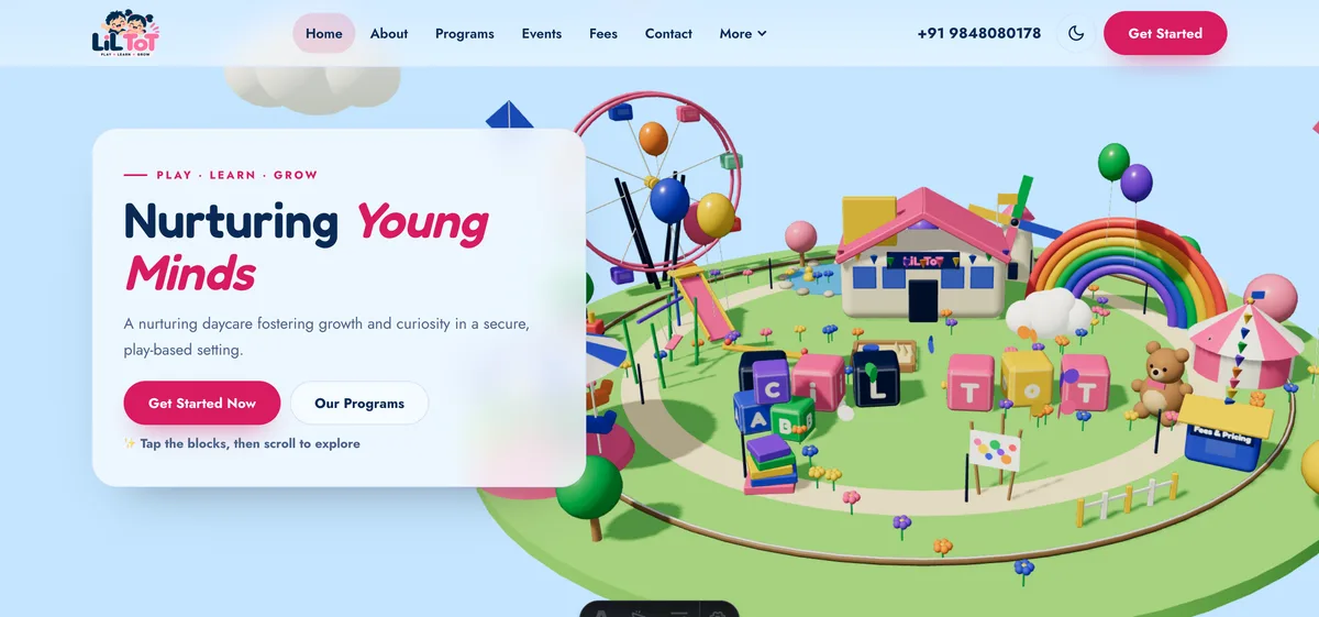
A playful toy-world 3D school site for parents, with a 3D scene on every page. It has the pages a play school needs: about, programs for infant, toddler and preschool, events, a fees page with daily, weekly, monthly and family passes, a team page, a gallery and a blog. It also has day and night themes. This demo was made for a play school in Bahadurpally, Hyderabad, and the contact form is not connected. Open the LiL ToT demo.
Kitewood Academy: a school and coaching institute
A 3D isometric campus where you tap a building, such as the library, labs, sports field or canteen, to open a short panel and a link. Behind it are programmes (primary, middle school, secondary, science and commerce streams, weekend coaching), admissions, fees with a currency selector, a sample faculty page, an events calendar and an FAQ. It also includes privacy, terms and accessibility pages. Open the Kitewood Academy demo.
Tunelark Music Academy: a music academy and studio
A ribbon landscape drawn from a synthesised signal changes shape with every instrument and course. It lists ten courses, explains how lessons work, shows batches and a schedule, and has practice tools including a scale explorer, a metronome and a fee planner, plus studio rental and plans. Sound is optional and off by default. Open the Tunelark demo.
Starhaven Planetarium: a planetarium and science centre
Tens of thousands of points orbit and spiral as you scroll, from a solar system out to a colliding galaxy, across nine different 3D scenes. It includes ten shows, times and ticket pages, a plan-your-visit page, a schools page, a sample sky calendar, a telescope calculator and a seat planner. Shows and prices are samples and nothing can be booked. Open the Starhaven demo.
Summit Slate Academy: a coaching and exam-prep institute
Surfaces morph from a saddle to a torus to a Möbius strip as you scroll, and you can drag and reshape them. The site has ten courses across engineering and medical entrance, civil services, school boards and foundation classes, plus batches, faculty, a mock test, study material, a study planner and fees with a currency selector. Its score-band explorer is sample analytics only, with no results or rank claims. Open the Summit Slate demo.
See these and demos for other sectors on the demo websites page.
From idea to launch: a plan for a school or coaching site
A focused site can go live in as little as 7 days. That suits a small school or a coaching centre with a handful of pages and content ready. A site with many streams, a fee calculator, a timetable tool, online forms with integrations or a lot of 3D takes longer. Per the pricing page, the price and timeline move with pages, features, integrations and timeline. Websites start from ₹8,888 in India and US$99 for international clients, and domain name and hosting are billed separately and stay in your name.
- Free consultation. Tell us who the site serves, what parents and students ask most often, and what the first step should be.
- Scoped, fixed-price proposal. Pages, timeline and one price in writing within 24 hours. Work starts only after you approve.
- Content gathering and approvals. Programmes, fees, dates, team details, photos with permissions, policies. Agree who signs off each item.
- Design and build. You see the layout early, then the full site on a real phone.
- Review. Check every fee, date, name and claim. Collect feedback from all stakeholders into one round.
- Domain, hosting and launch. We help you set up both in your name, then go live.
- Keep it current. Update the calendar, fees and admissions dates every term or batch.
How to start
If you run a school, coaching institute or learning business and want a site families can trust, read what our website development covers, see how a price is set on the pricing page, and contact us for a free consultation. You can also browse websites we have built, or read about website development trends for 2026.
Try it live
Open the real thing: demos run in a new tab with sample data, apps link to their own page.
 Live demoKitewood Academy demoTap buildings on a 3D isometric campus and open sample programmes, admissions and fees.
 Live demoLiL ToT demoExplore a toy-world 3D play school site with programs, events, a gallery and a blog.
 Live demoSummit Slate Academy demoDrag and reshape 3D maths surfaces, then try a sample mock test and study planner.
- ABrowse allAll demo websitesWorking demo sites across ten sectors.
- PBrowse allPricingWebsites from ₹8,888, with a fixed-price proposal within 24 hours.
- TBrowse allTalk about your websiteBook a free consultation and get a scoped proposal.
Frequently asked questions
01What should a school website include?
Programmes by class or stream, fees with inclusions, an admissions guide with dates and documents, teacher details, campus photos, an events calendar, FAQs, policies and an enquiry form. Make fees and admissions easy to find, and keep every page current.
02Should a school or coaching website show fees?
Yes, where you can. Clear fees with inclusions and extras build trust and cut enquiries that go nowhere. If fees vary, show a clear structure or a starting figure and invite families to talk to admissions about the rest.
03Can a coaching institute publish results on its website?
Only results you can prove, and only in line with the current advertising rules in your region, which you should check. A site that explains its teaching method honestly is often more convincing than big claims it cannot back up.
04Is a 3D website suitable for a school or academy?
It can be, when the 3D helps people learn or explore, such as a campus map or a science scene, and the essentials stay in plain text. Respect reduced-motion settings, keep sound off by default and test on a mid-range phone.
05How long does it take to build a school or coaching website?
A focused site can be live in as little as 7 days when content is ready. Larger scope, many courses, tools, integrations or slow approvals add time. The proposal states the timeline first, and domain and hosting are billed separately.