In this guide
People rarely visit a law firm, a tax practice or a fintech site for fun. They arrive worried, rushed or cautious, and within a minute or two they decide whether this is somewhere they can bring a question about contracts, money or compliance. A good website for a law firm, a CA practice or a fintech company does three things: it explains plainly what you do, it shows only the proof you can truthfully stand behind, and it makes the next step small enough to take today.
This guide covers what to include, what to leave out, how to plan the pages and how three of Zenocta's demo websites approach the job. It is about building websites, not about giving legal, tax or financial advice, and nothing here tells you what a regulator will accept. Check the current rules that apply to your profession and region.
What do visitors to a law, tax or fintech website come to do?
Most visitors fall into four groups, and the home page has to serve all of them without making any of them hunt.
- The worried first-timer has a specific problem and wants to know if you handle it. They scan your list of services for their own words ("rent agreement", "GST notice", "send money abroad").
- The comparer has three tabs open. They look for how you charge, how long a first reply takes and whether a real person will answer.
- The checker already has your name from a referral. They search for you to confirm you exist, that the office is real and that the person they were told about is listed.
- The returning client wants a phone number, a document list or a status page and nothing else.
What makes them leave is just as predictable: jargon with no explanation, stock photographs of handshakes, a contact page that is a single email address, big claims with nothing behind them, and pop-ups that appear before the page has loaded. In professional and financial services, one doubtful statement costs more than a missing one, because it makes everything else on the page look doubtful too.
A page and section map for a professional or fintech site
Start from the questions above and give each one a home. The table below is a starting map, not a fixed template. A single-partner practice might fold several rows into one page, and a fintech with several products will need more.
| Page | Purpose | Key elements |
|---|---|---|
| Home | Say who you help and what you do in one screen, then route people | One plain headline, three to six service entries in the visitor's words, one primary button, a short "how we work" strip |
| Services or practice areas | Let people find their own situation | One page per area, written for a non-specialist, with who it suits, what usually happens and what to bring |
| How we work | Remove fear of the unknown | Four or five steps from first conversation to outcome, with honest wording about what is uncertain |
| Fees or pricing approach | Answer the comparer | How you charge (fixed scope, time-based, in stages), what shapes a fee, what is explained before work starts |
| People | Show that real, accountable humans stand behind the work | Names, roles and qualifications you can document; leave the page out until you have real details |
| Insights or knowledge hub | Answer common questions and be findable for them | Short plain-language explainers, each with a date and a general-information note |
| Tools | Give something useful before any conversation | Calculators or checklists, labelled as illustrative where they are |
| Security (fintech) | Explain how you protect people, in words they can read | What you do, described plainly, with no badge or certificate you do not hold |
| Contact and book | Convert | Short form, phone, address, hours, what happens next and how long a reply takes |
| Legal pages | Set expectations and meet your obligations | Disclaimer, privacy, terms and an accessibility statement, written for your actual practice |
Trust signals: what to show and what to leave out
Trust on these sites comes from specificity and restraint. The rule is simple: if you cannot show it, prove it or take responsibility for it, do not put it on the page. That includes numbers. A site that says "trusted by thousands" with no basis does more harm than one that says nothing.
| Signal | Fine to show when | Leave out when |
|---|---|---|
| Names and qualifications | Each one is real, current and can be verified by the person who reads it | You are unsure of the exact wording of a title or registration |
| Years in practice | You can document the start date | It is a round number that sounds good |
| Office address and hours | The office exists and the hours are kept | It is a virtual address you do not staff |
| Client stories | The client has agreed in writing, and nothing confidential is exposed | You have to invent or disguise details to make it work |
| Outcomes and results | Your professional rules allow it and you can show the record | You would be implying that a result is typical or likely |
| Security and certifications | You hold the certificate and can say how to verify it | You are describing an intention or a plan |
| How you handle fees | Always. Explaining the approach is itself a trust signal | Never leave this vague |
Tip
Rules on how professionals and financial firms may describe themselves differ by profession and country. Before you publish claims, credentials or testimonials, check the current rules with your professional body or adviser. Zenocta builds the site; it cannot tell you what you are permitted to say.
Enquiry and conversion elements that suit this sector
People in these sectors do not buy on impulse. The aim is to lower the cost of the first step: a short conversation, a callback, a booked slot or a downloaded checklist. Pick one primary action and make it visible without scrolling.
- One primary button, such as "Book a consultation", repeated in the header and at the end of every service page.
- A short enquiry form: name, a way to reply, and one box for the question. Every extra field lowers the number of people who finish it.
- A plain warning on the form not to send confidential details, and a line on what happens to what they do send.
- A stated reply time you can actually keep, shown next to the form.
- A phone number that can be tapped on a phone, with the hours it is answered.
- A booking option for people who would rather choose a time than wait for a reply.
- A "what to bring" list for the first conversation, so people arrive prepared and feel guided.
- A confirmation message that says what happens next, not just "Thank you".
- For fintech: a clear, honest next step such as "see how it works" or "open the calculator", and a plain notice where a flow is a sample or not an offer.
Decide before design where each enquiry goes: one inbox, one named person, and a reply routine. An enquiry form that lands in an unwatched mailbox is worse than no form.
Content to prepare before design starts
Most delays in a website project come from content that arrives late. For a professional or financial business, the content is also the part that needs the most care, because every sentence reflects on you. Prepare this before design begins.
- A one-sentence description of who you help and with what, in the words your clients use.
- The list of services, each with two or three plain sentences and a "who it suits" line.
- Real names, roles and photographs of the people, with their written approval to publish them.
- Qualifications and registrations exactly as they should be worded, with how a visitor can verify them.
- Your fee approach in plain words: what you charge for, when, and what is explained before work starts.
- Address, phone, email, working hours and the area you serve.
- Your logo as a vector file, plus any approved brand colours.
- Draft disclaimer, privacy and terms text reviewed by someone qualified to review it.
- Three to six common questions with honest answers, for the FAQ.
- Any approved client testimonials, each with permission in writing. If you have none, say so and leave the section out.
How motion and 3D help or hurt in a trust-first sector
A serious firm does not need fireworks, but a little purposeful motion can make a complicated idea easier to follow. Used badly, it makes a site feel like it is selling instead of advising.
Motion helps when it explains. A process that moves from step to step as you scroll, a calculator whose chart redraws as you type, or a gentle background that sets a mood without competing with the text all earn their place. It hurts when it competes with reading, runs slowly on a mid-range phone or ignores people who have asked their device for less movement. A site in this sector should respect the reduced-motion setting, keep text on a calm, high-contrast background and never put a number or a legal note inside something that moves.
Keep any 3D light, load text first and test on a real phone. Our post on how website speed affects visitors explains why a heavy first screen costs you enquiries.
Mobile first, and found by the right people
Mobile
Many people will first meet your site on a phone, often in the middle of a worry. Make the phone number and the main button reachable with a thumb, keep tap targets at least 44 pixels, keep body text readable without zooming and use 16 pixel inputs so the form does not jump. Test the contact form on a real handset, not just a narrow browser window. A long form on a small screen is where most enquiries are lost.
Search visibility basics
Give every page a clear title and one clear heading in the words people search for. Put your name, address and phone number in the same form everywhere, so a visitor and a search engine see the same details. Write plain, specific answers to the questions your clients ask. Keep pages fast. None of this promises a ranking, and anyone who promises one is guessing. It simply makes your site easier to understand for both people and search engines. For the wider case, see why every business needs a modern website.
The business, finance and IT demos
Zenocta has built three working demo websites for this sector. They are fictional businesses with sample content: no real firm, advice, product or credential is described, and their forms send nothing. They are there so you can see how a site like yours could feel on a phone and a desktop.
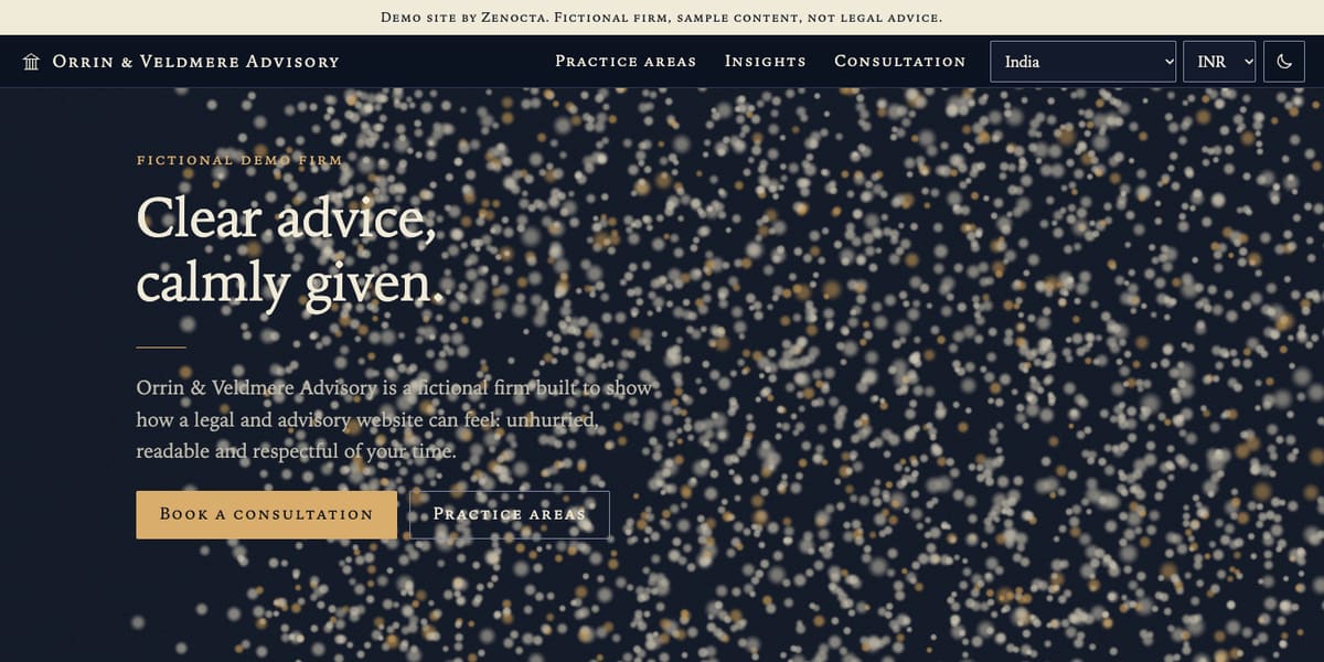
Orrin & Veldmere Advisory: a law and advisory firm
A calm, plain-language site over a field of drifting 3D particles that reshape as you scroll. It has six practice areas explained in ordinary words, a four-step "how a matter usually unfolds" section, anonymous sample team roles, illustrative scenarios, a fee approach page that explains three ways a firm might charge, and a consultation form that warns visitors not to enter confidential details. Every page carries a notice that it is not legal advice. Open the Orrin & Veldmere demo.
Ledgerly: a fintech and digital banking brand
Money drawn as ribbons on a living 3D ledger, with a card you can flip and tilt. It has product pages, savings and EMI calculators, a security page that explains the thinking and says it claims no certifications, and a visible notice that it is not a bank and not financial advice. Prices and amounts are labelled as samples. Open the Ledgerly demo.
Balance & Bearing Associates: a tax and compliance practice
A balance-sheet tower on a brass beam that levels as you scroll, with sliders to tip it and re-balance it. It has a list of services, pages for startups, small businesses and freelancers, a knowledge hub, eight illustrative tools and a compliance calendar that says its dates are loose seasons, not real deadlines. Every figure is labelled as an invented sample and no professional registration is claimed. Open the Balance & Bearing demo.
Look at how each demo handles honesty on the page. The notices are visible, the caveats are short and nothing is hidden in small print. That is a pattern you can reuse for a real firm. All three also work on a phone, and you can browse the full set in our website demo gallery.
From idea to launch: a realistic path
A focused professional site can go live in as little as 7 days. What moves the timeline is scope: how many pages, whether you want a blog, tools or a booking flow, and above all how quickly your content and approvals arrive. A site that needs legal or compliance review of every sentence will take longer than one where you approve the text yourself.
- Free consultation. Tell us who you help, what you want visitors to do and what you already have.
- Fixed-price proposal. Within 24 hours of the consultation you receive the scope, timeline and one price in writing.
- Content and approvals. You send the content from the checklist above; we flag gaps and anything that needs your professional review.
- Design and build. Pages are built mobile first, with the enquiry form routed to the inbox you chose.
- Review on a preview link. You test on your own phone and request changes.
- Launch. We go live, check the form delivers, and hand over. Domain and hosting are billed separately and stay in your name.
How to start
If you want a site along these lines, start with what Zenocta does as a website development company, check how pricing works (website builds start from ₹8,888 in India and US$99 internationally, and the final price depends on pages, features and integrations) and then tell us about your practice. You can also read about our website services or compare a corporate website with a landing page if you are not sure how big to go.
Try it live
Open the real thing: demos run in a new tab with sample data, apps link to their own page.
 Live demoOrrin & Veldmere Advisory demoA fictional law and advisory firm: plain-language practice areas, fee approach and a sample consultation form.
 Live demoLedgerly demoA fictional fintech: 3D money ribbons, a flip-and-tilt card and savings and EMI calculators.
 Live demoBalance & Bearing demoA fictional tax practice: a 3D balance-sheet tower, service pages and illustrative tools.
- ABrowse allAll demo websitesBrowse all 48 demo websites by sector.
- WBrowse allWebsite pricingWhat a Zenocta website build covers and how pricing works.
- TBrowse allTalk about your websiteDescribe your practice and get a scoped, fixed-price proposal.
Frequently asked questions
01What pages does a law firm or CA practice website need?
At minimum: a home page, one page per service or practice area, a how-we-work page, a fee approach page, a contact or booking page and legal pages. Add people, insights and tools once you have real content to put on them.
02Can I show client testimonials on a professional services website?
Only if they are real, you have written permission and your professional rules allow it. Check the current rules with your professional body. If you have none, leave the section out rather than inventing or softening anything.
03How do I make a fintech website feel trustworthy?
Explain what you do in plain words, show how you protect people without claiming certificates you do not hold, state clearly what is a sample or not an offer, and give visitors a human way to reach you.
04Is 3D or animation a good idea on a legal or financial website?
It can help when it explains something, such as a process or a calculator, but it must stay light, keep text readable and respect reduced-motion settings. Never put legal notes, fees or figures inside moving elements.
05How long does a website for a professional firm take?
A focused site can go live in as little as 7 days. Timelines grow with more pages, tools, bookings or review rounds, and with late content. The fixed-price proposal states the timeline before you approve anything.