In this guide
Website motion and animation can make a page clearer or make it unbearable, and the difference is rarely the amount of movement. It is whether each movement has a job. A menu that slides open tells you where it came from. A hero that flies in for two seconds before you can read it tells you only that the designer was proud of it. This guide sets out the principles Zenocta uses, a do and don't table, a worked example and a checklist you can hand to any designer or developer.
What is purposeful motion on a website?
Purposeful motion is movement that carries information. It does one of five things: it shows where something came from or went, it directs attention to what changed, it confirms that an action worked, it explains a process or a relationship, or it sets a mood that fits the subject. If a movement does none of those, it is decoration, and decoration has a cost in load time, battery and attention.
The test is simple. Remove the animation in your head. If the page loses meaning, the motion is doing work. If it only loses sparkle, ask whether the sparkle is worth what it costs.
Principle 1: match the motion to the meaning
The best motion on a page is chosen for the subject. A solar installer can show the sun crossing a roof because the sun is the subject. A watchmaker can show gears turning because gears are the product. A calm advisory firm can use a slow, quiet background because calm is the message. The same effect on the wrong subject is noise.
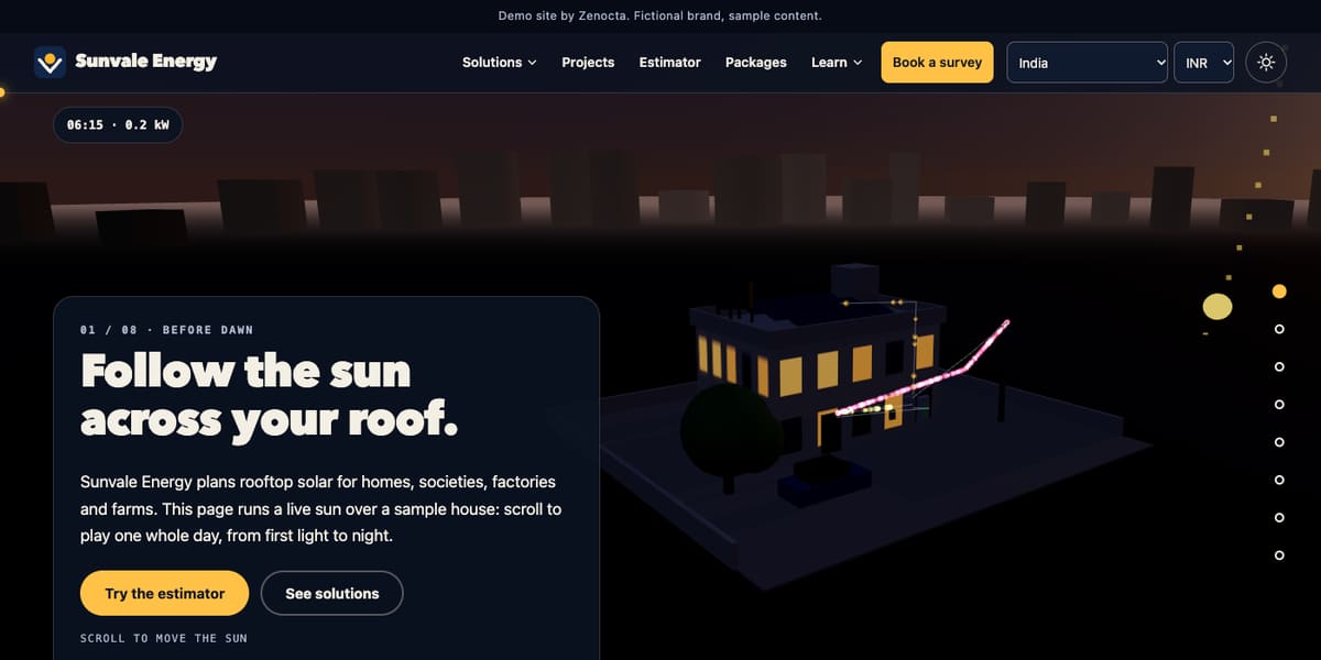
We looked at three of our demo websites to see this in practice. Sunvale Energy, a fictional rooftop solar installer, turns its home page into eight scroll chapters, from "Before dawn" to "Your roof", with a live sun over a sample house and a small readout of the time and the sample output. The motion is the explanation: scrolling is how you move the sun. Orrery Watch Works, a fictional watchmaker, turns a procedural gear train as you scroll, and on a watch page invites you to scroll to open the movement; the page says plainly that the 3D movement is a drawing, not a scan of a real calibre. Orrin & Veldmere Advisory, a fictional law firm, keeps a field of slow particles behind a plain headline, text on the left, buttons below. The motion sets a mood and stays out of the way of reading.
Principle 2: duration and easing
Speed is part of meaning. Too fast and the eye misses the change; too slow and people wait. The numbers below are common rules of thumb used by designers, not standards, and you should adjust them by testing on a real device.
| Kind of motion | Typical duration | Easing that usually fits |
|---|---|---|
| Button press, hover, toggle | 100 to 200 ms | Ease-out, so it responds at once and settles |
| Menu, dropdown, small panel | 150 to 300 ms | Ease-out on opening, ease-in on closing |
| Content reveal on scroll | 250 to 500 ms | Ease-out, with a small movement (a few pixels to a few tens) |
| Page or large panel transition | 300 to 600 ms | Ease-in-out for movement across the screen |
| Continuous ambient motion | Slow and looped | Linear or very gentle, and pausable |
Two habits help. First, make entrances ease out (fast start, soft landing) and exits ease in, so things arrive with confidence and leave without fuss. Second, keep similar things consistent: if cards reveal over 350 ms in one section, they should do the same in the next.
A worked example with made-up numbers
Imagine a product page where four cards reveal as you scroll. Each card takes 350 ms to fade and rise, and each starts 60 ms after the previous one. The last card finishes at 350 + (3 × 60) = 530 ms after the first begins. That is quick enough that nobody waits. Now change it to 600 ms per card and a 200 ms stagger: the last card finishes at 600 + (3 × 200) = 1,200 ms. A visitor scrolling at normal speed has already moved past the first card before the last one appears. The numbers are invented for illustration, but the arithmetic shows why stagger adds up faster than people expect.
Principle 3: performance comes first
Motion that stutters is worse than no motion. Smooth animation depends on how much work the device has to do on every frame, and a mid-range phone has far less to spare than a developer's laptop.
- Animate position, scale, rotation and opacity (the properties a browser can handle cheaply) rather than width, height, top or left.
- Avoid animating heavy effects such as large blurs and shadows over big areas.
- Keep the number of things moving at once small, and stop animations that are off screen.
- Load images and 3D scenes after the text and the main action are usable, so reading and tapping never wait.
- Provide a lighter or static version for small screens and slower devices.
- Test on a real mid-range phone and a throttled connection, not just a fast desktop.
Speed also affects search and sales, which our post on how website speed impacts SEO and customer experience covers in more depth. We make no promise about scores or rankings for any site; the point is that heavy motion is something to budget, like image weight.
Principle 4: respect prefers-reduced-motion
Some people get dizzy, nauseous or distracted by large movement, parallax and constant motion. Operating systems let them say so, and browsers expose that setting to your page as prefers-reduced-motion. A site should read it and calm down.
Calm does not mean broken. In practice it means that content which animates in should simply appear, long pinned scroll sequences should become ordinary readable sections, and looping effects should stop or become static. The demos show different ways to do it. We checked the stylesheets and scripts: Sunvale's reduced-motion rules turn its tall pinned scroll story into plain stacked sections that are all visible, and hide the chapter navigation and live readout. Orrery's rules do the same for its pinned story and also cut animation and transition time to almost nothing, showing hidden content without movement. Orrin's script adds a "reduce" mode when the setting is on, and the same mode can be previewed by adding ?reduce=1 to the address, which removes reveal animations and the split-heading effect. Each approach keeps the content and removes the choreography.
Tip
Ask your developer to show you the page with reduced motion switched on, in both a browser and the real phone. If the reduced version is missing content, hides buttons or leaves large empty gaps, it is not finished.
Principle 5: never let motion block reading
This is the principle that costs the most when ignored. People came to read, choose or ask. Do not make them wait for an animation to finish.
- Text first. Headlines and body copy should be readable at once, not after a reveal.
- Never move behind text. Busy backgrounds under paragraphs lower contrast and make lines hard to follow; keep text on calm areas.
- No scroll-jacking that fights the user. If a pinned scroll story is used, it should follow the visitor's own pace and leave the rest of the page scrollable in the normal way.
- Do not hide key information. Prices, hours, phone numbers and forms should never depend on an animation having run.
- Give control. Anything that moves by itself for more than a few seconds should be pausable. Accessibility guidance asks for this.
- Keep a skip. If an intro plays, let the visitor skip it, and do not replay it on every page.
Do and don't: a quick table
| Do | Don't |
|---|---|
| Use motion to show cause and effect: a drawer slides from the side it lives on | Animate things in random directions with no relation to where they belong |
| Keep most effects under half a second | Make visitors wait through a long intro |
| Ease out on entrances and ease in on exits | Use linear motion for interface elements |
| Animate transform and opacity | Animate layout properties on big areas |
| Match the effect to the subject, such as a sun for a solar page | Use the same effect everywhere because it looks impressive |
| Offer a calm version for reduced-motion settings and small screens | Assume everyone has a fast phone and no sensitivity to movement |
| Keep text on calm backgrounds | Run busy motion behind paragraphs |
| Test on a real mid-range phone | Judge only on the designer's laptop |
A printable motion checklist
Use this when you review a design or a build. Each line should get a yes.
- Every moving element has a stated job: show, direct, confirm, explain or set a mood.
- No animation delays text, prices, phone numbers or the main button.
- Most interface motion is under half a second; longer motion is a deliberate story.
- Entrances ease out, exits ease in, and similar elements share the same timing.
- Staggered reveals add up to a total time you have calculated.
- Only cheap properties are animated, and off-screen motion stops.
- Reduced-motion mode shows all content, hides nothing important and removes the choreography.
- Ambient or looping motion can be paused, and text never sits on moving, busy areas.
- A real mid-range phone has been used to test scrolling, taps and the form.
- The site is fully usable with motion switched off.
How to add motion to a site step by step
- List the moments. Mark the places where a change needs explaining: navigation, a process, a product, a result.
- Give each a purpose. Write one sentence saying what the motion should help the visitor understand. Drop any that cannot.
- Set a budget. Decide the duration, the easing and the maximum number of simultaneous movements.
- Build the static version first. The page must work and read well with no motion at all.
- Add the motion and the reduced-motion version together. Do not leave the calm version for later.
- Test on a real phone, with and without reduced motion, and fix what stutters or hides content.
Where Zenocta fits
Zenocta builds websites with scroll, 3D and motion where it helps, and quieter pages where it does not. Websites start from ₹8,888 in India and US$99 internationally, in as little as 7 days for a focused site, and the final price depends on pages, features and integrations; domain and hosting are billed separately. Browse the demo websites on your own phone, then tell us what you need or read how pricing works. For wider context see website development trends for 2026.
Try it live
Open the real thing: demos run in a new tab with sample data, apps link to their own page.
 Live demoSunvale Energy demoA fictional solar installer: scroll to move a live sun across a 3D roof, with a calmer layout for reduced motion.
 Live demoOrrery Watch Works demoA fictional watchmaker: a procedural gear-train movement that turns as you scroll.
 Live demoOrrin & Veldmere Advisory demoA fictional law firm: a slow particle field behind plain text, with a ?reduce=1 preview of the calm mode.
- ABrowse allAll demo websitesBrowse all 48 demo websites by sector.
- WBrowse allWebsite pricingWhat a Zenocta website build covers and how pricing works.
- TBrowse allTalk about your websiteDescribe your site and get a scoped, fixed-price proposal.
Frequently asked questions
01How long should website animations last?
As a rule of thumb, button and hover effects run 100 to 200 milliseconds, menus and panels 150 to 300, and content reveals 250 to 500. Test on a real device and keep similar elements consistent across the site.
02What is prefers-reduced-motion and do I need to support it?
It is a setting in the visitor's device that asks websites to use less movement. You should support it: show animated content as plain content, turn pinned scroll sequences into normal sections and stop looping effects.
03Does animation slow down a website?
It can, especially large effects, heavy 3D and many things moving at once on a mid-range phone. Animate cheap properties, stop off-screen motion, load text first and test on a real device to find out.
04Is scroll-triggered animation bad for usability?
Not by itself. It works when it follows the visitor's pace and explains something. It hurts when it hijacks scrolling, delays text or hides key information. Always keep the page fully usable with motion switched off.
05How do I know whether an animation is worth keeping?
Ask what job it does: show where something came from, direct attention, confirm an action, explain a process or set a mood. If the page loses no meaning without it and it costs load time, remove it.