In this guide
Most small-business visitors now meet your website on a phone, one-handed, often outdoors and often in a hurry. A site that looks polished on a designer's monitor but needs pinching, zooming and precise tapping on a phone loses those visitors quietly. This mobile-first website design checklist turns "works on mobile" into checks you can run yourself, with real widths and sizes, before anything goes live.
What does mobile-first actually mean?
Mobile-first means the phone layout is designed first and the larger layouts are built outward from it, rather than shrinking a desktop design until it fits. The order matters because a phone forces decisions: what is the one thing a visitor must do, which information comes first, and what can wait. When those answers are clear on a small screen, the tablet and desktop versions are easier and usually better.
It also means judging the site by how it feels in the hand. A layout can fit the screen perfectly and still be tiring to use, because the buttons are tiny, the text is faint or the main action sits where a thumb cannot reach it. The checks below cover both fit and feel.
Which screen widths should you test?
You cannot test every device, but four widths cover most situations. Test them in a browser's device mode first, then on at least one real phone.
| Width | Represents | What to look for |
|---|---|---|
| 360px | A small, common phone width | Nothing cut off, nothing overlapping, headlines that wrap sensibly, buttons that still fit on one line or stack neatly |
| 390px | A typical modern phone | The layout feels intended, not squeezed; images and cards use the width well |
| 768px | A tablet in portrait, or a large phone turned sideways | Columns appear at a sensible point, navigation still works by touch, no stretched images |
| 1024px | A tablet in landscape or a small laptop | Desktop navigation appears only if there is room, hover effects do not become the only way in |
Also drag the browser narrower than 360px to see how the layout breaks, and rotate to landscape, where a tall fixed header can swallow most of the screen. Real phones differ from emulators in speed, touch accuracy and browser toolbars, so always include a real device in your final pass.
How big should tap targets be?
A fingertip is far less precise than a mouse pointer. A common guideline is a target of at least 44px by 44px for anything that can be tapped, with enough space between neighbours that a slightly off-centre tap does not hit the wrong thing.
- Buttons and links in the main flow are at least 44px tall, and the tappable area can be larger than the visible text or icon.
- Icon-only buttons, such as the menu, search and close, are at least 44px by 44px.
- Links in running text have enough line spacing to be tapped without catching the line above or below.
- Neighbouring targets have a gap, for example 8px, so people do not hit the wrong one.
- Form fields, checkboxes and radio buttons have large tappable labels, not just a small box.
A quick fit check, with simple arithmetic
Say your header has five icon buttons, each 44px wide, with 8px between them. Five buttons take 5 x 44 = 220px, and four gaps take 4 x 8 = 32px, so the row is 252px wide. A 360px screen with 16px of side padding leaves 360 - 32 = 328px, so the row fits with 76px to spare. Add two more buttons and the row grows to 7 x 44 + 6 x 8 = 356px, which no longer fits. That is the moment to move something into a menu rather than shrinking the targets.
What is the minimum text size?
Small text is the most common mobile failure. Set body copy at around 16px and treat 12px as the absolute floor for captions, labels and legal notes. Anything smaller forces pinch-zoom, and zoom is a sign of a design that did not plan for phones.
- Body text is comfortable to read at arm's length without zooming, and 12px is the smallest size anywhere on the page.
- Line length stays moderate: very long lines on a tablet are as tiring as tiny type on a phone.
- Contrast is strong, including text over images and gradients, and in bright daylight.
- The page still works if a visitor increases their device's text size.
- Headlines wrap cleanly at 360px without a single word dangling on its own line or running off the screen.
How should forms behave on a phone?
Forms are where enquiries are won or lost. Phone keyboards cover half the screen, typing is slow, and every extra field costs completions. Our guide to online booking pages shows the same principle applied to appointments.
- Form inputs use a font size of at least 16px, which avoids zoom-on-focus when a visitor taps into a field.
- Each field uses the right keyboard: a telephone pad for phone numbers, an email keyboard for email, a numeric pad for quantities.
- Browser autofill hints are set so that a name, phone number or email can be filled in with one tap.
- Labels sit above fields and stay visible while typing, instead of vanishing placeholder text.
- Error messages appear next to the field, say what to fix, and are not colour-only.
- The submit button is large, near the last field and still visible when the keyboard is open.
- Only ask for what you will use. A name, a phone number and one open question is often enough.
How do you check for horizontal scrolling properly?
A page that slides sideways is a clear sign that something is wider than the screen: an image, a table, a long word or a fixed-width element. The trap is that a designer can hide the symptom with an overflow rule, which makes the page look fine while content is silently cut off the edge of the screen.
So do not rely on a quick scroll test alone. Check the positions of elements:
- Open the site at 360px and scroll the full page, watching for any sideways drift.
- Look at the right edge of every section, card, image, table and button row. Nothing should touch or pass the screen edge.
- Use the browser's element inspector to find any element whose right edge extends beyond the viewport width, since a hidden-overflow rule can make the page's own width reading look clean.
- Check tables and code or price grids. If they must be wide, let them scroll inside their own frame.
- Repeat at 390px and 768px, and in landscape.
Tip
Grid and flex children are a common culprit. If a card with a long word or a wide image makes its column grow, give the child permission to shrink, and let long words wrap.
What happens to hover effects on a touch screen?
Touch screens have no hover. A menu that opens on hover, a tooltip that carries the price or a card that reveals its button only when the pointer is over it will be hidden, or will behave oddly after a tap.
- Hover effects are limited to devices that really have hover, using a media query such as
(hover: hover). - Nothing important, such as a price, a link or a label, appears only on hover.
- Every hover-revealed control has a visible or tap-based equivalent on touch.
- Menus open on tap, close on a second tap or outside tap, and work with a keyboard.
- Tooltips are replaced by visible text or a tap-to-open note.
Are the main actions within thumb reach?
On a large phone held in one hand, the top corners are the hardest places to reach and the lower middle is the easiest. Place the actions that matter most where a thumb can reach them without shifting the grip.
- The main action, such as call, WhatsApp, book or enquire, is available in a bar at the bottom of the screen on key pages.
- That bar does not cover the last lines of content, so leave padding under the page.
- The menu button and the close button are easy to find, and the menu itself can be dismissed without a stretch.
- Destructive actions are never placed beside the most common action.
- Phone numbers are real links that dial when tapped, and addresses open a map.
Keep any fixed header slim, so that on a small or landscape screen it does not eat the view. The reasoning connects with the speed advice in our post on website speed and customer experience: a phone user is often on a weaker connection and has less patience.
How do motion and heavy media behave on phones?
Motion is part of the experience, but a phone has less power than a laptop. Keep animation purposeful, honour a visitor's reduced-motion setting, compress images, and avoid autoplaying large media. If you add 3D or scroll scenes, give the phone a lighter version and keep all information in plain text. Our guide to 3D and scroll-driven websites goes through the trade-offs.
Three demo websites to inspect on your phone
Open these on a real phone and apply the checks above. All are demonstrations, and their forms are not connected, so nothing is sent.
Navee Builders: a bottom action bar and 16px fields
This concept site for a Hyderabad real-estate developer shows a fixed row of Call, WhatsApp and Enquire buttons at the bottom of the screen on narrow widths, with buttons at least 44px tall. At narrow widths its styles turn a card list into a sideways-scrolling rail, each card about 86% of the screen width so the next one peeks in, which signals a swipe. Its form inputs are set at 16px with generous height. Open Navee Builders.
Elevo Interiors: a simple header and a touch-aware form
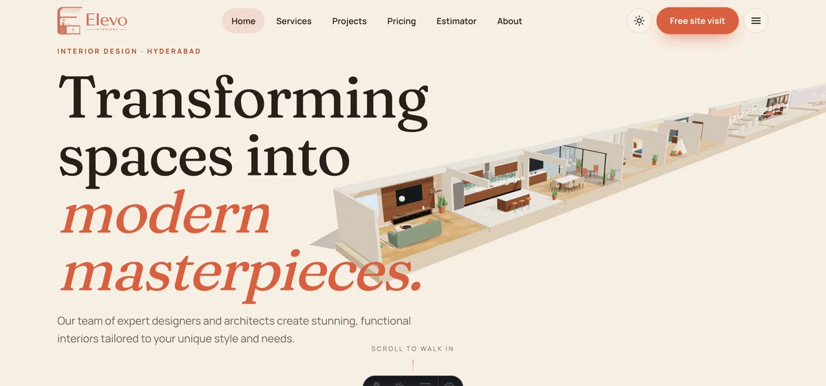
This concept site for a Hyderabad interior design company pairs a single "Free site visit" button in the header with a menu button. Its phone field is typed as a telephone number with autofill hints, so the right keyboard opens, and its stylesheet uses the hover media query for some effects. Open Elevo Interiors.
Ampwing Electric: large targets and a calm fallback
This fictional electric two-wheeler brand sets many of its controls to at least 44px in height, uses the hover media query for much of its hover styling, and swaps its scroll story for a plain stacked layout when a visitor has asked for reduced motion. Open Ampwing Electric.
A pre-launch mobile checklist
- Tested at 360, 390, 768 and 1024px, in portrait and landscape, and on one real phone.
- No horizontal scroll, and element positions checked, not only the page width.
- Every tappable item is at least 44px, with space between neighbours.
- No text below 12px, and body text near 16px.
- Form inputs at 16px, correct keyboards, autofill hints, labels above fields.
- Hover-only behaviour guarded for touch, with no information hidden behind hover.
- Primary action reachable by thumb, phone numbers dial, addresses open maps.
- Images compressed, fixed headers slim, reduced motion respected.
- The page works on a slow connection and does not rely on a scene to show content.
Common mobile mistakes
- Designing on a large monitor and checking a phone last. Reverse the order.
- Hiding overflow to make a problem disappear. The content is still cut off.
- Tiny close buttons on pop-ups and menus. They frustrate people and can trap them.
- Autoplaying heavy media. It drains data and battery.
- Treating the phone as a smaller desktop. It is a different context with different goals.
How to run a mobile review in an afternoon
- Pick the three jobs. Decide what a phone visitor most needs: call, book, find the address, see prices.
- Do each job on a real phone. Time it and note every moment of friction.
- Run the width checks. Work through 360, 390, 768 and 1024 using the table above.
- Fix in order of impact. Broken layouts and unreachable actions first, then tap sizes, then polish.
- Re-test and keep the checklist. Run the same list after every redesign or major content change.
How to start
Every site we build is designed phone-first. A focused website can go live in as little as 7 days, with the final price depending on pages, features and integrations. Builds start from ₹8,888 in India and US$99 internationally, and domain and hosting are billed separately. Explore the demo websites library, read our case for a modern website, check pricing, or contact us for a scoped, fixed-price proposal.
Try it live
Open the real thing: demos run in a new tab with sample data, apps link to their own page.
 Live demoNavee Builders demoA bottom bar of Call, WhatsApp and Enquire buttons, a swipeable property rail and 16px form fields.
 Live demoElevo Interiors demoA simple header action and a phone field that opens the telephone keyboard.
 Live demoAmpwing Electric demoLarge touch targets, hover guarded for touch and a calm reduced-motion layout.
- ABrowse allAll demo websitesBrowse working demo sites for thirty-six sample businesses.
- PBrowse allPricingWhat a website costs and what moves the price.
- TBrowse allTalk about your siteAsk for a phone-first website and get a scoped, fixed-price proposal.
Frequently asked questions
01What screen widths should I test a mobile website at?
Test at 360px, 390px, 768px and 1024px, in portrait and landscape, using your browser's device mode first and then at least one real phone. Also drag the window narrower than 360px to see how the layout breaks.
02How big should buttons be on a mobile website?
Aim for at least 44px by 44px for anything tappable, including icon-only buttons, with a small gap such as 8px between neighbours. The tappable area can be larger than the visible icon or text, which keeps designs neat.
03Why should form inputs be 16px on mobile?
Inputs set smaller than 16px can make the browser zoom in when a visitor taps a field, which shifts the layout and is annoying to undo. Using 16px or larger avoids zoom-on-focus and keeps typing comfortable.
04How do I check for horizontal scroll on a phone layout?
Scroll the page at 360px, then check the right edge of every section, image, table and button row. Because hidden-overflow rules can mask problems, use the inspector to find elements that extend beyond the viewport width.
05What should I do about hover effects on touch screens?
Limit hover effects to devices that support hover, using the hover media query, and never hide prices, links or labels behind hover. Give every hover-revealed control a visible or tap-based alternative so touch visitors lose nothing.