In this guide
A 3D website can make a visitor stop scrolling and look. It can also make a phone hot, a page slow, and a simple question such as "what time do you open?" hard to answer. The honest position is that a 3D website is a tool: brilliant for some businesses and a poor choice for others. This guide sets out when it helps, when it hurts, and how to decide.
What do we mean by a 3D or scroll-driven website?
Two ideas often appear together. A 3D website draws a scene in the browser, usually on a canvas using the graphics chip: a turning product, a landscape, a cloud sky. A scroll-driven website ties the visitor's scrolling to what happens on screen, so that moving down the page moves a camera, takes an object apart or advances a story in chapters.
Both rely on code that runs on the visitor's device. That is the source of every benefit and every cost in the sections below.
When does a 3D website earn its place?
Look for a real reason that the visitor needs to see something move or turn. Good signs:
- The product has a shape or a mechanism. A vehicle, a watch movement or a piece of furniture is easier to understand when it can be turned or taken apart.
- The offer is a journey. A route, a township, a dive or a flight is a sequence, and scroll is a natural way to move through a sequence.
- The purchase is emotional and considered. Premium goods, travel and property reward a few seconds of atmosphere.
- The brand needs to be remembered. A distinctive scene can separate a business from a dozen near-identical competitors.
- You can explain something invisible. A battery, a model of the solar system or a cross-section is hard to photograph and easy to show.
If two or three of these apply, a scene is worth discussing. If none apply, you are probably decorating.
When does it hurt?
- The visitor is in a hurry. Clinics, emergency services and local trades are found by people who want a phone number, an address or an opening time, now.
- The site is mostly information. Long documents, price lists, policies and support content are better as fast, plain pages.
- Your audience is on older phones or slow connections. The heavier the scene, the more of them you lose.
- The business cannot maintain it. A 3D scene is part of the codebase and needs updating, testing on new devices and fixing when browsers change.
- The scene replaces the content. If the only way to find a price is to scroll through an animation, visitors will leave.
For a business that mainly needs enquiries and information, a clean, quick page often wins. Our post on corporate websites and landing pages helps you decide what structure suits your goal first.
What are the honest trade-offs?
Performance
A scene needs a graphics library, geometry or shaders, and often textures. That is more to download and more to compute than a normal page. The device does the drawing, so a new laptop and an older phone have very different experiences. Heavy scenes also use more battery. The fix is not to avoid 3D entirely but to budget for it: keep the first screen light, load the scene after the headline and button appear, and cap how much detail the scene draws on phones. Read our guide to website speed and customer experience for why this matters commercially.
Accessibility
Moving, full-screen content creates barriers. Text over a changing background can lose contrast. Scroll hijacking, where the page scrolls differently from the visitor's expectation, confuses people and breaks keyboard and assistive-technology use. Make sure that every control works with a keyboard, that focus is visible, that all information is available as real text, and that nothing important is only shown inside the canvas.
Reduced motion
Some visitors set their device to reduce motion, because movement can cause dizziness or nausea. A responsible 3D site reads that setting and offers a calm alternative: no camera sweeps, no parallax and a static or stacked version of the story. This is not an extra. It is part of the build.
Low-end phones
Many of your visitors are on mid-range or older handsets. Plan for a lighter mode that lowers the resolution, simplifies effects or replaces the scene with a still image. Test on a real modest phone, not only a desktop with a throttled network.
Search visibility
Search engines read text. If your headings, descriptions and prices are inside the canvas, they are invisible to search and to anyone using a screen reader. Keep every page's content in ordinary HTML, with a clear title and h1, and let the scene sit behind or beside it. Speed also affects how people experience the site. No design can promise a ranking, but a heavy page that hides its content makes the job harder.
A decision table for owners
These examples are imaginary businesses, used to show the reasoning. Your answer depends on your visitors and your content.
| Situation (imaginary) | Suggested approach | Why |
|---|---|---|
| Electric scooter brand launching a new model | Scroll-driven 3D teardown on the home page, plain model and price pages | The mechanism is the story, and the specifications still need ordinary text |
| Neighbourhood clinic with walk-in patients | Fast plain site, at most a light illustration | Visitors want hours, phone and directions immediately |
| Travel company selling custom routes | A scene on the home page, itineraries and enquiry forms in plain pages | Atmosphere sells the idea, text sells the trip |
| Accountancy practice | Mostly plain, with restrained motion | Clients value clarity and speed over spectacle |
| Planetarium or science centre | 3D throughout, with strong text and fallbacks | The subject is visual and the audience expects wonder |
| Wholesaler with a large price list | Plain, searchable catalogue | Users scan and compare; animation slows them down |
What did we see in three demo websites?
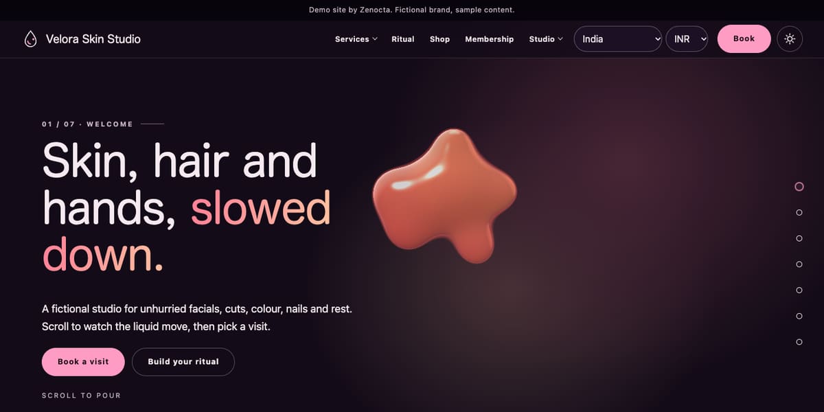
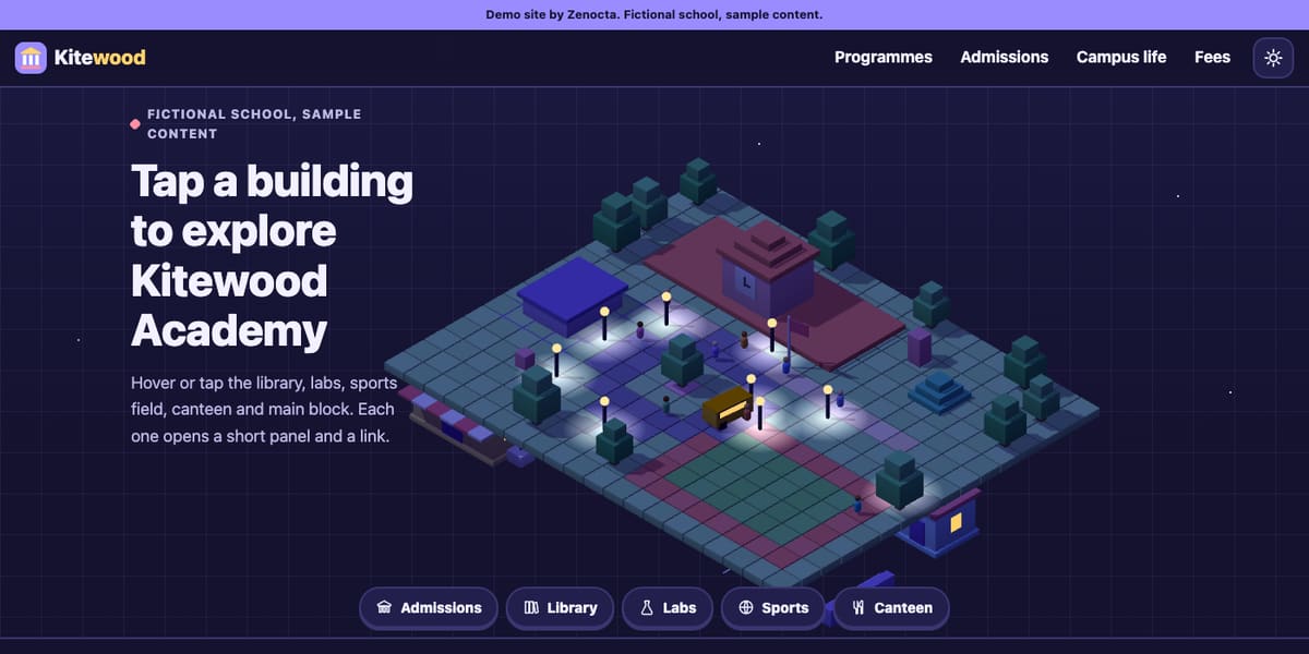
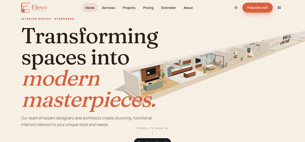
Zenocta built a library of working demos for fictional businesses, each using 3D and scroll in its own way. Here is what we observed in three of them. Each is sample content and nothing can be booked or bought.
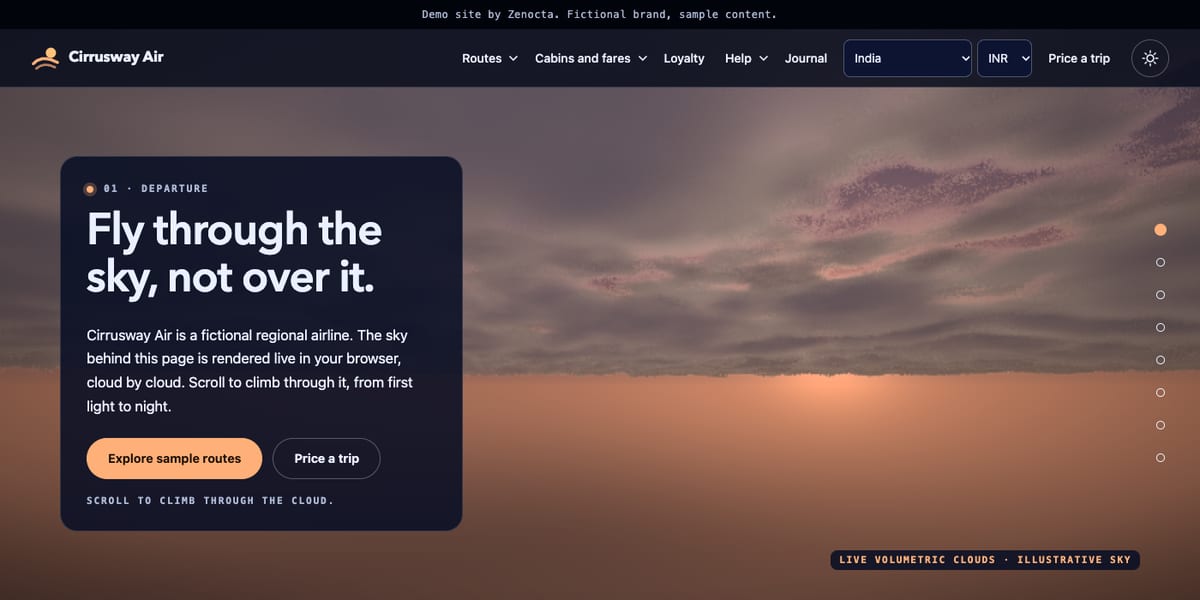
Cirrusway Air: a live sky that climbs as you scroll
The page is a regional airline brand with a cloud sky rendered live in the browser, climbing from dawn to night as you scroll. The headings and copy for every chapter are present in the page's own HTML, not just inside the scene. The page's script checks the visitor's reduced-motion setting, and it picks a lighter default quality on narrow screens and on devices reporting few processor cores or little memory. Fares, routes and a calculator sit on ordinary pages. Open Cirrusway Air.
Ampwing Electric: a teardown tied to scroll
An electric scooter comes apart panel by panel to reveal the battery, cells, hub motor and controller, then reassembles and rides away. Its stylesheet includes a reduced-motion rule that turns the pinned story into a plain stacked layout, and the script limits drawing resolution more tightly on phones than on desktops. Price, range and model details live on normal pages. Open Ampwing Electric.
Starhaven Planetarium: tens of thousands of points
The home page says it draws about forty thousand points computed on the graphics card, moving from the Solar System out to a galaxy collision across eight scroll chapters. Each show page builds its own object, such as a ringed planet. Show details and prices are written as normal text, and the stylesheet switches off the animated page transitions for visitors who prefer reduced motion. Open Starhaven Planetarium.
The common pattern is worth copying: the idea lives in the scene, the facts live in the text, and the settings of the visitor's device are respected.
A checklist to run before you commit
- Can you state, in one sentence, what the 3D shows that a photograph cannot?
- Does the first screen show the headline and the main button as text before the scene finishes loading?
- Is every price, address, opening time and policy available as ordinary text?
- Does the site honour the reduced-motion setting, with a calm alternative?
- Does it have a lighter mode for low-power phones or a still-image fallback?
- Can a keyboard user reach every control, with visible focus?
- Does the enquiry button stay reachable while the scene runs?
- Have you tested on a modest phone over a mobile connection?
- Who will maintain the scene next year, and what will it cost?
Common mistakes with 3D websites
- Starting with the effect. Choose the message and the action first. The scene serves them.
- Putting content inside the canvas. Text drawn in a scene cannot be searched, selected or read aloud.
- Testing only on a fast laptop. The visitor's phone is the real test.
- Ignoring the end of the scroll. After the story, give visitors a clear plain page with the next step.
- Making every page a scene. One memorable scene plus quick, plain pages usually beats a heavy site throughout.
- Forgetting maintenance. Browsers, devices and libraries change.
How to add 3D to a website without regret
- Write the content first. Headings, copy, prices and calls to action, in plain text.
- Choose one idea for the scene. One mechanism, one journey or one object.
- Set a budget. Decide how heavy the first screen may be and how much detail phones will get.
- Build the fallback beside it. A reduced-motion layout and a lighter mode are part of the first version.
- Test on real devices. Include a modest phone and a slow connection, and use the browser's tools to measure.
- Launch, then watch. Check how visitors use the site and trim whatever does not help them reach the goal.
Tip
Ask your developer to show the site with the reduced-motion setting turned on and with a lighter mode forced. If either looks broken, the build is not finished.
For where this fits among current ideas, see website development trends for 2026.
How to start
A focused website can go live in as little as 7 days, and adding a scene lengthens the timeline in proportion to its scope. Builds start from ₹8,888 in India and US$99 internationally, with the final price depending on pages, features and integrations. Domain and hosting are billed separately. Explore the full demo websites library, check the pricing page, or talk to us about whether 3D fits your business. If the answer is no, we will say so.
Try it live
Open the real thing: demos run in a new tab with sample data, apps link to their own page.
 Live demoCirrusway Air demoA live cloud sky that climbs as you scroll, with fares and routes on plain pages.
 Live demoAmpwing Electric demoAn electric scooter taken apart on scroll, with a stacked layout for reduced motion.
 Live demoStarhaven Planetarium demoAbout forty thousand points drawn on the graphics card across eight scroll chapters.
- ABrowse allAll demo websitesBrowse working demo sites for thirty-six sample businesses.
- PBrowse allPricingWhat a website costs and what moves the price.
- TBrowse allTalk about your siteAsk whether 3D fits your business and get a scoped, fixed-price proposal.
Frequently asked questions
01Does a 3D website hurt SEO?
It can if the content lives inside the canvas or the page is slow. Search engines read text, so keep headings, descriptions and prices in ordinary HTML, give each page a clear title, and keep the first screen light. No design can promise a ranking.
02How do I make a 3D website accessible?
Keep all information as real text, make every control work with a keyboard with visible focus, keep text contrast strong over moving backgrounds, avoid hijacking scroll, and honour the reduced-motion setting with a calm alternative layout.
03Will a 3D website work on low-end phones?
Only if it is planned for them. Lower the drawing resolution, simplify effects or show a still image on modest devices, load the scene after the headline and button, and test on a real mid-range phone before launch.
04What kinds of business benefit from a scroll-driven site?
Businesses selling something visual or sequential: vehicles, premium goods, travel, property, science and brand-led products. Clinics, trades with urgent visitors and information-heavy sites usually do better with fast, plain pages.
05Can Zenocta build a 3D website for my business?
Yes. A focused site can go live in as little as 7 days, and a scene adds time in proportion to its scope. We will also tell you honestly if plain pages would serve your visitors better. Hosting and domain are billed separately.