In this guide
An accessible website is one that works for people with different eyes, hands, devices and situations: someone with low vision, someone who cannot use a mouse, someone on a phone in bright sun, someone who gets dizzy from moving screens. Most of the fixes cost little when they are planned from the start and cost a lot when added at the end. This accessible website checklist covers contrast, keyboard use, alt text and reduced motion in plain English, then gives you a 15 minute test routine that does not need special software.
Why does accessibility matter for a business website?
Because the people who struggle with an inaccessible site are not rare, and many of the fixes help everyone. High contrast helps in sunlight. Clear headings help anyone skimming. Large tap targets help every thumb. Captions help in a noisy place. A site that works for more people loses fewer enquiries.
There are also legal and contractual duties in some countries and sectors. They differ by place and change over time, so check the current rules that apply to your business and your customers, and ask an adviser if you are unsure. This guide is a practical checklist, not legal advice and not a certification.
What is good colour contrast?
Contrast is the difference in brightness between text and the background behind it. Pale grey text on white, or light text over a busy photo, is hard to read for many people, and for everyone on a bad screen. A widely used guideline asks for a contrast ratio of at least 4.5 to 1 for normal body text, with a lower bar for very large text. You do not need to calculate it by hand: a contrast checker takes two colours and tells you the ratio.
- Body text, button labels and form labels are clearly readable against their backgrounds.
- Text placed on images has a solid or darkened panel behind it, not just a hope that the photo is dark enough.
- Placeholder text in form fields is not the only label, and it is dark enough to read.
- Colour is never the only signal. An error is shown with words or an icon as well as red.
- Both light and dark themes, if you offer them, are checked separately.
- Links look like links, for example underlined or clearly different from the surrounding text.
How should a site work with a keyboard?
Some visitors never use a mouse. They use the Tab key, a switch device or voice commands that act like one. If your menus, forms and galleries only respond to a mouse, those visitors are stuck.
- Every link, button, field and menu can be reached and used with Tab, Shift+Tab, Enter, Space and Escape.
- You can always see where you are: a visible outline or highlight follows the focus.
- The order of focus follows the visual order of the page.
- A "skip to content" link near the top lets keyboard users bypass the long menu.
- Pop-ups and lightboxes open with the keyboard, trap focus only while open, and close with Escape.
- No element captures focus and refuses to let go.
The one minute keyboard test
Put your mouse aside, open your home page and press Tab repeatedly. Can you see where focus is at every step? Can you open the menu, fill in the contact form and send it, using only the keyboard? If not, you have found a real problem.
What makes good alt text?
Alt text is a short written description of an image, read aloud by screen readers and shown if the image fails to load. It also gives search engines a clearer idea of what a picture shows. Write it for someone who cannot see the picture and needs to know why it is there.
- Describe what the image shows in a short sentence, for example "Wide ceramic bowl with a green glaze on a wooden shelf".
- If the image carries a message, say the message. If it shows a chart, state the main finding in nearby text.
- Do not start with "image of" or "picture of", since software already announces it.
- Purely decorative images, such as a background swirl, should have an empty alt attribute so they are skipped.
- Logos link to home or identify the business: use the business name as the alt text.
- Do not put important words, prices or phone numbers only inside an image. Put them in real text too.
- Show images and logos in full. Do not crop a logo or a product so that part of it disappears.
How should motion respect reduced motion settings?
Many phones and computers have a setting that says "reduce motion". People turn it on because movement causes dizziness, nausea, distraction or pain. A website can read that setting and act on it. That matters more as sites use scrolling animation, parallax and 3D scenes.
- If reduced motion is on, scenes stop moving, scroll-triggered reveals show their content immediately and page transitions are switched off.
- Nothing important is communicated by motion alone. The same information is in text.
- Anything that moves on its own for more than a few seconds, such as a slideshow or a ticker, can be paused.
- Nothing flashes more than a few times per second.
- Videos do not start with sound, and they have captions or a transcript.
- Scroll behaviour stays predictable. Do not take control of scrolling in ways that fight the visitor.
Which other basics should you check?
- Headings: one main heading, then subheadings in order, never chosen only for size.
- Link text: "Read the pricing page" rather than "click here".
- Forms: every field has a visible label, errors say what is wrong and how to fix it, and fields are large enough to tap.
- Language: the page declares its language, and text is written in plain words.
- Text size: the page still works when the visitor increases the text size or zooms in.
- Tap targets: buttons and links are large enough for a thumb, with space between them.
What is a 15 minute accessibility test anyone can do?
You do not need to be an expert to find the biggest problems. Set a timer and work through these steps on your home page, one key service page and your contact page.
- Minutes 1 to 3, keyboard. Tab through the page. Check focus is visible, the order makes sense and you can reach every control.
- Minutes 4 to 6, zoom and text size. Zoom the browser to 200 percent and increase the system text size on a phone. Check nothing overlaps, disappears or needs sideways scrolling.
- Minutes 7 to 9, contrast. Check your main text, button and link colours in a contrast checker. Look at the page in bright light on a phone.
- Minutes 10 to 11, images. Inspect a few key images and confirm their alt text says something useful. Check the logo is fully visible.
- Minutes 12 to 13, motion. Turn on reduced motion in your device settings and reload. Do scenes stop moving and does the content still read in full?
- Minutes 14 to 15, forms. Submit your contact form with a mistake and then correctly. Check the error message is clear and the confirmation appears.
Write down every problem you find, with the page and a one-line note. Take that list to your builder.
What are the common problems and their quick fixes?
| Problem | Why it matters | Quick fix |
|---|---|---|
| Light grey text on white | Hard to read for many people, and for anyone on a poor screen | Darken the text until a contrast checker passes it |
| Text over a photo with no backing | Readability changes with the image | Add a solid or darkened panel behind the text |
| No visible focus outline | Keyboard users cannot tell where they are | Restore a clear focus style on links and buttons |
| Menu only opens on hover | Touch and keyboard users cannot open it | Make it open on tap and Enter as well |
| Images without alt text | Screen reader users hear a file name or nothing | Write a short description, or empty alt for decoration |
| Cropped logo or product image | Part of the brand or product is lost | Fit the whole image in its box |
| Animation ignores reduced motion | Can cause dizziness or distraction | Switch off scene and scroll animation when the setting is on |
| "Click here" links | Out of context, they mean nothing | Use descriptive link text |
| Form fields without labels | Unclear for screen reader users, and confusing when placeholder text disappears | Add a visible label to every field |
| Tiny tap targets | Mis-taps on phones, especially for people with limited dexterity | Enlarge buttons and add space between them |
What do the demo websites show?
We checked the page source and published pages of three Zenocta demos, which are working sites for fictional businesses. None of them has had a formal audit, so treat them as examples of practice, not as proof of compliance.
Oruvale Studio
On Oruvale Studio, a demo photography site, we found a skip-to-content link, visible focus styles and rules that switch off page transition animation under reduced motion. Its images carry descriptive alt text, such as a sentence describing a tall arch with soft flowers against a dusk sky. Its own accessibility page says galleries have a plain index below the 3D stage, and that the main text colours reach a ratio of 4.5 to 1 or better. We did not measure that ratio ourselves.
Fernwick Commons
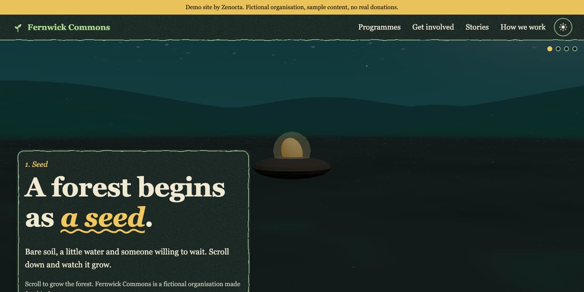
The Fernwick Commons demo has a skip link, focus styles, and rules in its styles that turn off reveal animation and collapse the tall scroll story when reduced motion is on. Its accessibility page is honest about limits: it says the demo has not had a formal audit or testing with assistive technology users, and that the 3D scenes are decorative with the same information in text.
Claywheel Studio
On Claywheel Studio we found a skip link and styles that shorten animation and hide a decorative element when reduced motion is requested. The 3D vessel is a decoration for the real content, which stays readable text.
What should you ask your website builder?
- How do you handle keyboard use, visible focus and a skip link?
- Do you check colour contrast in every theme, and who signs off the colours?
- Who writes alt text, and how will I edit it later?
- Does the site honour the reduced motion setting, and what happens to 3D scenes?
- Can I see the site tested on a real phone and with the keyboard before launch?
- What happens to accessibility when I add new pages or images myself?
Which mistakes are easy to avoid?
- Treating accessibility as a final polish step instead of a design rule.
- Choosing brand colours first and checking contrast never.
- Using images for text such as prices or offers.
- Assuming an automated checker finds everything. It finds some problems, and a person must judge the rest.
- Making a fancy 3D page the only way to reach content.
How do you start?
Run the 15 minute test on your current site and send the list to your builder. If you are planning a new site, say up front that you want keyboard use, contrast, alt text and reduced motion handled, and ask to see them tested. Read how Zenocta builds websites, check the pricing page (websites from ₹8,888, domain and hosting billed separately), browse the demo websites, or talk to us. For the wider case for a site people can actually use, see why every business needs a modern website.
Try it live
Open the real thing: demos run in a new tab with sample data, apps link to their own page.
 Live demoOruvale Studio demoA demo photography site with a skip link, descriptive alt text and reduced motion rules.
 Live demoFernwick Commons demoA demo community group site with an honest accessibility page and reduced motion handling.
 Live demoClaywheel Studio demoA demo ceramics site with a skip link and reduced motion styles.
- ABrowse allAll demo websitesBrowse every working demo website.
- WBrowse allWebsite pricingWebsites from ₹8,888. Domain and hosting are billed separately.
- TBrowse allTalk about your websiteAsk for accessible design in your scoped, fixed-price proposal.
Frequently asked questions
01What are the most important accessibility checks for a small business site?
Start with readable colour contrast, keyboard use with a visible focus, useful alt text on images, clear headings and labelled forms, and respect for the reduced motion setting. These cover problems that block many visitors and are quick to test.
02What is reduced motion and why should my site respect it?
It is a device setting for people who find movement uncomfortable or disorienting. A site that respects it stops animated scenes, shows scroll reveals immediately and switches off page transitions, while keeping all the content readable.
03How do I write good alt text?
Describe what the image shows in a short sentence and why it matters, without starting with 'image of'. Use an empty alt for decoration, use the business name for a logo, and put important text in real text, not only in images.
04Can an automated tool tell me if my website is accessible?
It can find some problems, such as missing alt text or low contrast, but not all of them. A person still needs to test with a keyboard, zoom, reduced motion and real content. Treat tool results as a starting point.
05Is my business legally required to make its website accessible?
It depends on your country, sector and customers, and the rules change over time. This guide is not legal advice. Check the current rules that apply to you, and ask a qualified adviser if you are unsure.