In this guide
Someone looking at a ring, a saree or a watch online cannot touch it, try it on or hear the clasp close. Your website has to do that work with pictures, plain words and a clear way to come and see the real thing. A good website for a boutique, a jeweller or a watch brand makes each product easy to understand, tells the story of the maker without padding, and gives a nervous buyer a safe next step.
What do visitors to a boutique, jewellery or watch site come to do?
Retail visitors behave differently from visitors to a service business. They browse first and decide later, and they often return several times before they act.
- Browse. They want to see the range quickly, by category, and move between pieces without losing their place.
- Judge quality. They look closely: material, finish, size, fit, weight. Small details decide whether a piece feels worth its price.
- Check the practical details. Price, sizing, care, shipping and returns, and whether they can see the piece in person.
- Look for the person behind it. A brand story, how things are made and who is responsible for them is part of what a buyer pays for, especially at a higher price.
- Find you offline. Many will visit a store or book an appointment after a long look online.
What makes them leave: product photographs that are cropped or too small to judge, a missing size guide, a price that appears only after a long click path, slow pages, and a checkout or enquiry route that is hard to find. A beautiful hero is wasted if the buyer cannot work out what the piece looks like from the side.
A page and section map for a boutique, jeweller or watch brand
Retail sites grow from the product outward. Decide the unit you sell (a piece, a collection, a bespoke commission) and build the map around it.
| Page | Purpose | Key elements |
|---|---|---|
| Home | Set the mood and send people to the range | One strong product or craft image, a short brand line, entries to the main categories, a visible way to enquire or book |
| Collections or categories | Let people browse quickly | A clean grid with whole-product images, names, a starting price where you want to show one, and simple filters |
| Product page | Answer every question before it is asked | Several views, a short description, material and size details, price, care, shipping and returns, related pieces, one clear action |
| Craft or brand story | Explain why it is worth the price | How it is made, what materials are used, who makes it, in plain claims you can back up |
| Guides | Help people choose with confidence | Size, fabric, metal, stone or movement guides, written for beginners |
| Care and servicing | Reassure about ownership | How to look after the piece, what a repair or service involves |
| Appointment, viewing or visit | Turn browsing into a visit | A short form: name, contact, piece of interest, preferred date and time |
| Stores or boutiques | Be found in person | Address, hours, directions, phone |
| Journal | Teach and be found for it | A few useful articles, not a daily feed |
| FAQ, shipping and returns, legal | Set expectations | Your own policies in plain words, plus privacy and terms |
What a product page has to answer
The product page does most of the selling, so spend the most care on it. A buyer should be able to answer these questions without leaving the page.
| Question in the buyer's head | What answers it |
|---|---|
| What does it really look like? | Several whole-product views, not one crop. Close-ups of the detail that matters |
| Will it fit me? | A size or fit guide linked from the page, with your own measurements |
| What is it made of? | Material and finish notes in plain words |
| How much is it? | The price, shown where the buyer expects to see it, in the currency they use |
| What if I change my mind? | Your own shipping and returns wording, short and easy to find |
| How do I look after it? | A care note and a link to the full guide |
| Can I see it first? | A viewing, appointment or visit option beside the main button |
Conversion elements that suit a retail brand
Not every brand sells in a cart. A jeweller or watchmaker may prefer a private viewing request, while a boutique may want a basket. Pick the route that matches how your customers really buy, and do not force a checkout onto a product that is bought in person.
- One clear action on each product page: add to bag, request a viewing, or ask about this piece.
- A short appointment or viewing form with the piece pre-selected when the buyer arrives from its page.
- A size, fit or finder tool that narrows a long range down to a few pieces.
- Colour, material or strap choices that change the picture, so buyers see what they are choosing.
- Shipping, returns and care notes on the product page, not hidden behind several clicks.
- A gifting guide for the buyers who are not sure what to choose.
- A phone or message option for questions that a form cannot answer.
- A currency choice if you sell to buyers in more than one country.
- A saved or shortlisted pieces list, if the range is large and decisions take time.
Content to prepare before design starts
Retail sites live or die on photographs and product data. Gather these before layout begins, because the layout depends on what you actually have.
- Photographs of every product on a clean background, from several angles, large enough to zoom. Show the whole piece: images should never be cropped so that part of the product is cut off.
- Lifestyle or on-the-body images where they help scale, kept separate from the product views.
- A product sheet for each piece: name, material, dimensions or sizes, weight where relevant, colours and price.
- Your logo as a vector file, and the way it should appear on light and dark backgrounds.
- The brand story: who makes the product, where, and what makes it different, in claims you can support.
- Your shipping, returns, care and servicing wording, written by you, in plain language.
- Store addresses, hours, phone and the way you want enquiries handled.
- Customer reviews only if they are real and you have permission to show them.
- The categories and the names you want to use for them.
Tip
Rules on labelling, quality claims, pricing display and returns differ by product and country. Check the current rules for your category and region before you write product claims or policies. A website cannot make a claim that your product cannot back up.
How motion and 3D help or hurt a retail site
This is the sector where 3D can earn its place. A product that turns, a ring that opens into the facets of a stone, a fabric that drapes when you move your pointer or a watch movement you can open all show something a flat photograph cannot. Done well, they help a buyer judge the piece.
The risks are real. Heavy 3D slows pages on mid-range phones, which is where many of your visitors are. An effect that hides the product behind a gimmick makes buying harder. Anything that moves without pause is tiring and can be difficult for people who have asked their device for reduced motion. A sensible approach is to keep a clear still photograph or static view as the baseline, load the 3D only where it adds information, respect the reduced-motion setting, and make sure price, size and the main button stay readable and still. Our post on website development trends for 2026 puts this in a wider context.
Mobile first, and found by the right people
Mobile
Most browsing happens on a phone. Product images should fill the width, swipe or tap to the next view and never be cropped to fit. Keep the main button reachable with a thumb, tap targets at least 44 pixels, text at least 12 pixels and form inputs at 16 pixels. Test the full path from home to a finished enquiry on a real phone, in portrait, with the price and the size guide in view.
Search visibility basics
Give each product and collection a clear title, a plain heading and a short description written for people, not for a search engine. Keep your store name, address and phone number consistent everywhere. Write simple guides that answer the questions buyers actually ask. Keep pages fast, because slow pages lose visitors before they see a product. None of this promises a ranking. It makes your site easier to understand, and our post on how website speed affects search and customers explains the speed side.
The fashion, retail and luxury demos
Zenocta has built three working demo websites for this sector. They are fictional brands with sample content: the pieces, prices, policies and forms are samples, nothing is sold and nothing is sent.
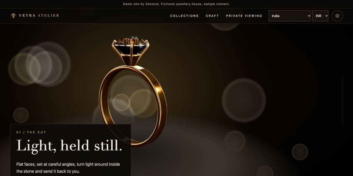
Veyra Atelier: a fine jewellery house
Scroll from a whole ring into the facets of the stone. The site has collections and individual piece pages, a ring builder where you pick a setting, metal, stone, cut and size, gem cut and "4Cs" learning pages, a metals guide, bespoke and bridal guides and a private viewing request form with a piece selector. A notice states that it is not a valuation or an offer. Open the Veyra Atelier demo.
Threadwell Atelier: a fashion and textile boutique
Real-time cloth drapes, billows and wraps a dress form. The shop has sarees, kurtas and dresses, and stoles, each product page lets you change the colourway, size and view (drape, breeze, flat swatch, worn on form), and there are fabric, size, tailoring and care guides, a sample bag and a currency selector. Product pages list fabric and fit notes plus sample shipping and returns wording. Open the Threadwell Atelier demo.
Orrery Watch Works: a mechanical watchmaker
A procedural gear-train movement turns with your scroll, then lifts apart and reassembles. There are ten watches with detail pages and sample specification tables, a watch finder, a strap configurator, servicing plans that explain what each includes, a journal and an appointment form. The 3D movement is labelled as a drawing, not a scan of a real calibre. Open the Orrery Watch Works demo.
Notice how each one chose a different conversion route: a viewing request, a sample bag and an appointment. Browse the others in our website demo gallery.
From idea to launch: a realistic path
A focused retail site, with a smaller range and a simple enquiry route, can go live in as little as 7 days. Scope moves the timeline: the number of products and pages, whether you want a basket or integrations, 3D features, and how quickly photographs and product data arrive. The proposal states the timeline before you approve anything.
- Free consultation. Share the range, how customers buy today and the route you prefer: enquiry, appointment or basket.
- Fixed-price proposal. Scope, timeline and one price in writing within 24 hours of the consultation.
- Collect photographs and product data. Send images and a product sheet for each piece; we flag what is missing.
- Design and build. Pages are built mobile first, with whole-product images and a clear action on every product page.
- Review on a preview link. Test on your own phone and request changes.
- Launch. Live site, tested enquiry route and handover. Domain and hosting are billed separately.
How to start
Read how Zenocta works as a website development company, see how pricing works (website builds start from ₹8,888 in India and US$99 internationally, depending on pages, features and integrations), and then tell us about your brand. You can also compare the demos in our website services.
Try it live
Open the real thing: demos run in a new tab with sample data, apps link to their own page.
 Live demoVeyra Atelier demoA fictional jeweller: 3D gem, ring builder, collections and a private viewing form.
 Live demoThreadwell Atelier demoA fictional boutique: real-time cloth, colourways, size guide and a sample bag.
 Live demoOrrery Watch Works demoA fictional watchmaker: a 3D gear-train movement, a watch finder and servicing plans.
- ABrowse allAll demo websitesBrowse all 48 demo websites by sector.
- WBrowse allWebsite pricingWhat a Zenocta website build covers and how pricing works.
- TBrowse allTalk about your websiteDescribe your brand and get a scoped, fixed-price proposal.
Frequently asked questions
01What should a jewellery or boutique product page include?
Several whole-product views, a short description, material and size details, the price, care and shipping and returns notes, related pieces and one clear action such as add to bag or request a viewing.
02Do I need an online shop, or is an enquiry form enough?
It depends on how your customers buy. High-value, personal pieces often sell through a viewing or appointment request, while lower-priced items suit a basket. Choose the route your customers already trust and add the other later.
03Is 3D worth it for a watch, jewellery or fashion website?
It can be, when it shows something a photograph cannot, such as a stone's facets or how cloth drapes. Keep a still image as the baseline, keep the 3D light for phones and respect reduced-motion settings.
04How should product photos be prepared for a website?
Shoot each piece whole, on a clean background, from several angles and large enough to zoom. Provide close-ups of key details. Images should never be cropped so that part of the product is cut off.
05How long does a boutique or jewellery website take to build?
A focused site can go live in as little as 7 days. A larger range, a basket, 3D features or late photographs and product data lengthen it. The fixed-price proposal states the timeline before you approve anything.