In this guide
A wedding photographer, a pottery studio and a community group have little in common except one thing: visitors decide in seconds whether they trust the person behind the work. A photographer is judged on frames, a craft studio on pieces you can almost feel, and a non-profit on whether its story is real and its accounts are open. A good website for a photographer, a craft studio or a community group lets the work and the evidence lead, and keeps everything else out of the way.
What do visitors to creative and community sites come to do?
Each of the three has a different visitor with a different worry.
- The couple or family looking for a photographer wants to see work that matches their taste, find out what a package covers, and check whether their date is free. They leave when the gallery is slow, the prices are hidden behind a form, or every picture looks the same.
- The buyer or learner looking at a craft studio wants to see the piece from several sides, know its size and how long it takes to arrive, or find a class that suits a beginner. They leave when photos are tiny, sizes are missing or the booking path is unclear.
- The volunteer, supporter or partner looking at a non-profit wants to know what the group actually does, who is behind it and how to help. They leave when the site is all slogans, with no named programmes, no stories and no way to check anything.
Notice that none of these visitors is looking for a clever animation. They are looking for proof and for a clear next step.
Which pages does each site need?
Keep the first version small and complete rather than wide and thin. This map covers the pages that earn their place for each type of business. Use the rows that apply to you.
| Page | Purpose | Key elements |
|---|---|---|
| Home | Show the work and say who it is for in one screen | A strong first image or object, one sentence about what you do, one main button (view work, shop, get involved) |
| Portfolio or albums (photographer) | Let visitors judge style by category | Categories such as weddings, portraits and events, whole albums rather than single shots, captions that name the setting |
| Shop or collection (craft studio) | Make each piece easy to understand | Several views, size, material, care note, price, how long it takes to make or ship |
| Programmes (non-profit) | Name each thing the group does | One short page per programme: what it does, where, who it helps, how to take part |
| Packages, classes or ways to help | Answer the money and effort question openly | A comparison table of what each option includes, a clear note on what is extra |
| Process or how we work | Reduce the fear of the unknown | Four to six short steps from first call to delivery or first class |
| Stories, journal or updates | Show that real people and real time sit behind the site | Dated entries, names used with permission, honest notes on what did not go to plan |
| Transparency or about (non-profit) | Let people check you | Who runs the group, what documents exist and where to read them |
| Contact or enquiry | Turn interest into a conversation | A short form, a phone number, WhatsApp or email, a promised reply time you can keep |
Which conversion elements suit a portfolio, a studio or a cause?
A conversion is whatever you want the visitor to do next. For creative and community sites it is rarely "buy now". It is usually a conversation, a booking or a pledge of time. Choose the few that fit.
- Photographer: an enquiry form that asks for event type and date, packages shown openly, a date check so people know early whether you are free, and a clear process so the first message feels safe.
- Craft studio: a shop with filters (for example wheel-thrown or hand-built), honest lead times, a class page with level, length and seats, and an estimator or note on what a typical order might cost.
- Non-profit: three clear ways to help (give time, give resources, spread the word), a volunteer form that asks only what you need, an events list with dates, and a contact route a real person answers.
- One main button per screen, repeated at sensible points, never a wall of equal buttons.
- A phone and WhatsApp tap target on mobile, because many first contacts start there.
Show the price range or the effort
Visitors skip businesses that make them guess. A photographer who shows three package levels, a studio that shows class fees and a group that says how many hours a volunteer day takes all get fewer, better enquiries than ones who say "contact us for details". If a fixed price is not possible, give a range and say what changes it.
What should you prepare before design starts?
Creative sites are only as good as the material they are built from. Most delays come from content that arrives late, not from design. Gather this first.
- Photographer: a shortlist of 20 to 30 of your strongest frames chosen by album, consistent in colour and edit style, with a one-line caption each and permission from the people shown.
- Craft studio: clean photos of each piece from at least three angles, exact sizes, materials, care instructions, prices, and how long a piece takes to make or reach the buyer.
- Craft studio classes: level, session length, number of weeks, seats, what to wear or bring, and what happens if someone misses a session.
- Non-profit: a plain description of each programme, who runs it, where it happens, and two or three real stories told with the consent of the people in them.
- Non-profit documents: whichever reports, accounts, registration details and policies your organisation actually has. Check the current rules for what you must display, and never list a document you cannot show.
- Your domain name plan. Domain and hosting are billed separately from the build and stay in your name, so decide who will own the accounts.
How do you show real work, real people and real accounts?
Trust is the product on all three kinds of site. Each one earns it differently.
Photographers
Show whole albums, not only the best single frame, so a couple can see how an entire day looks. Name the kind of day (small family ceremony, long festival, quiet portrait session). Get written permission before you publish a client's pictures, and tell clients up front where their images may appear. Alt text should describe each picture in a sentence, which also helps anyone using a screen reader.
Craft studios
Be honest about handmade variation. If every glaze comes out slightly different, say so, and show two examples of the same piece. State lead times plainly, including firing and drying where they apply. A short journal that explains a process, such as why clay is wedged before throwing, shows expertise without a single sales line.
Non-profits
Say what was counted, over what period, by whom, and show what did not work as well as what did. Keep running costs separate from programme costs on any page that shows how money is used. Link to the actual documents so readers can check. Do not display numbers you cannot back up, and check the current rules for any registration, receipt or tax statement before you put wording about them on the site.
How can motion and 3D help, and when do they hurt?
Motion works well on creative sites when it shows the work: an album that turns its pages as you scroll, a pot that is shaped live as you move, a forest that grows as you read. It hurts when it hides the work behind a loading screen, makes pages heavy on a mid-range phone, or keeps moving for someone who has asked their device for less motion.
- Weight: large images and 3D scenes are the biggest cause of slow pages. Size images for the screen, load them lazily below the first view, and keep the first screen light. See also website speed and customer experience.
- Reduced motion: if a visitor's device asks for reduced motion, scenes should stop moving and reveals should switch off. The content must still read in full.
- A plain fallback: a gallery should still be usable as an ordinary list of images and captions if the 3D stage does not load.
What matters most on a phone?
Couples browse photographers on the sofa, shoppers look at pottery on the bus, and volunteers find a group through a message someone forwarded. Most first visits happen on phones, so design for the thumb first.
- Tap targets at least 44 pixels high, with enough space between them.
- Body text at a readable size, form fields at 16 pixels so the page does not jump when someone taps a field.
- Galleries that swipe or scroll naturally, with pictures fully visible rather than cropped at the edges.
- A call, WhatsApp or enquiry button within easy reach, not only in the top corner.
How do you make a creative site easy to find?
Search visibility starts with basics that cost nothing to get right, and no builder can promise a ranking. Give every page a clear title and one main heading that says what it is ("Wedding photography albums", "Wheel-thrown ceramic bowls", "Tree planting programme"). Write real descriptions, not slogans. Put your name, area and contact details in the same form on every page, add alt text to images, and keep pages fast. If you serve one city or a few areas, say so in plain words and give each area page its own useful content. The wider case for a site that works hard is in why every business needs a modern website.
The creative and community demos
Zenocta has built three demo websites for this sector. All three are working sites for fictional businesses, with sample content, and none of them takes real bookings, orders or donations. Open them to see the ideas above in practice.
Oruvale Studio (wedding and event photography)
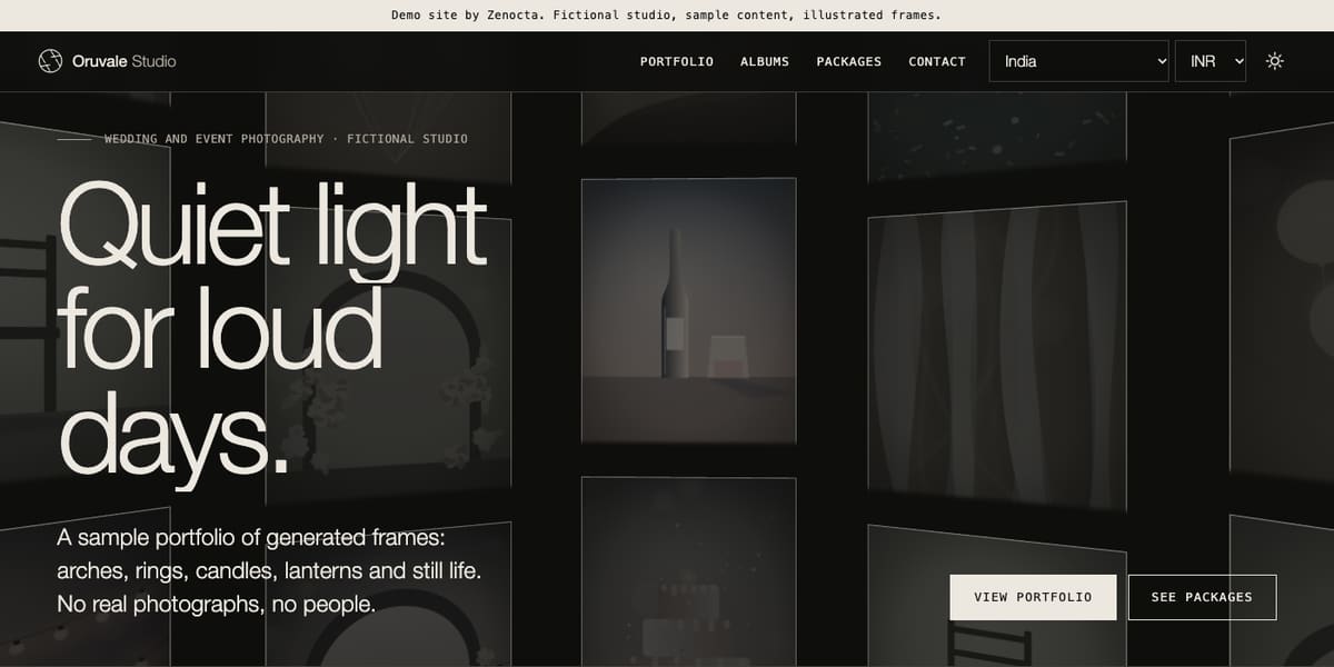
Oruvale shows a 3D image wall on the home page, six albums and portfolio categories such as weddings, pre-wedding, engagement, maternity, portraits and events. Its packages page compares three sample packages side by side, and a date check page shows how an availability calendar would feel with invented dates. The frames are generated illustrations, not real photographs. The site also has a plain page describing what it does for reduced motion, keyboard use and contrast. Open the Oruvale Studio demo.
Claywheel Studio (ceramics studio and shop)
Claywheel throws a vessel live on a potter's wheel and reshapes it as you scroll. Behind the scene it has a shop of ten sample pieces with a filter for thrown and hand-built ware, four sample classes with levels and seat counts, a vessel designer and a cost estimator, plus journal posts about clay, glaze and firing. Prices and dates are samples. Open the Claywheel Studio demo.
Fernwick Commons (community and environment group)
Fernwick grows a 3D forest from bare soil to canopy as you scroll. It has six programmes, stories, events, a get-involved page, and an impact page and a transparency page that are clearly labelled as illustrative samples and explain what a real report should contain. The donate page is a demonstration with no payment taken. Open the Fernwick Commons demo.
You can browse the full set of Zenocta demo websites on the demo websites page.
How does a site like this go from idea to launch?
A focused site with a handful of pages can go live in as little as seven days. More pages, a shop, class booking, a large gallery or other features take longer, and the proposal states the timeline before you approve anything. What moves the timeline is the number of pages, the features and integrations, and how quickly your content and feedback arrive.
- Decide the one action. Booking an enquiry, buying a piece, joining a class or volunteering. Pick the main one.
- Gather your material. Use the checklist above: images with captions, prices, class details, programme descriptions, documents you can actually show.
- Book a free consultation. Talk through your audience, devices, deadline and any tools you already use.
- Review the fixed-price proposal. Scope, timeline and price in writing within 24 hours of the consultation. Nothing starts until you approve it.
- See the design early. Check the page map, the first screen and the phone layout while changes are still quick.
- Test and launch. Check on real phones, with the keyboard and with reduced motion on, then connect your domain and go live.
- Improve from real use. Add albums, pieces, stories and updates as your work grows.
How do you get started?
If you run a studio, a craft business or a community group and want a site that shows the work first, start with a conversation. Read how Zenocta builds websites, check what the starting price covers on the pricing page (websites start from ₹8,888, and domain and hosting are billed separately), and then tell us about your work. We reply with a scoped, fixed-price proposal.
Try it live
Open the real thing: demos run in a new tab with sample data, apps link to their own page.
 Live demoOruvale Studio demoA fictional wedding photography studio with a 3D image wall, albums, sample packages and a date check.
 Live demoClaywheel Studio demoA fictional ceramics studio with a live potter's wheel, a sample shop, classes and a cost estimator.
 Live demoFernwick Commons demoA fictional community group with a 3D forest that grows on scroll, programmes, stories and sample transparency pages.
- ABrowse allAll demo websitesBrowse every demo website, each a working site for a fictional business.
- WBrowse allWebsite pricingWebsites from ₹8,888 with a fixed-price proposal. Domain and hosting are billed separately.
- TBrowse allTalk about your websiteTell us about your work and get a scoped, fixed-price proposal.
Frequently asked questions
01How many images should a photographer put on a website?
Choose quality over quantity. A shortlist of 20 to 30 strong frames across a few albums is enough to show style and range. Show whole albums so visitors see how a full day looks, and keep every image sized for fast loading.
02Should a craft studio sell online or just show its work?
It depends on how much you make and how you ship. If each piece is one of a kind or ships rarely, an enquiry form may suit you better than a full cart. Decide this before design, because a shop adds scope, features and time to the project.
03What should a non-profit website show to build trust?
Name each programme, say who runs it, tell real stories with consent, and publish whatever documents your organisation actually has, such as reports and policies. Never show numbers or registrations you cannot back up, and check the current rules for what you must display.
04Is a 3D homepage a good idea for a creative business?
It can be, if it shows the work and the page stays light and usable. Keep the first screen fast, give the 3D scene a plain fallback, support keyboard use and respect reduced motion settings. If it slows the page or hides the work, simplify it.
05How long does a website for a studio or community group take?
A focused site can go live in as little as seven days. A shop, class booking, a large gallery or many programme pages take longer. Your fixed-price proposal states the timeline before you approve anything, and late content is the most common delay.