In this guide
Someone looking for a flat, a plot or a new kitchen is making one of the larger purchases of their year, and they usually do it over weeks, on a phone, in between other things. A real estate website or an interiors website has to help that person find a specific project, judge the quality of the work, and ask a question without feeling committed. This guide covers the pages, the enquiry flow, the content to prepare, and how to use 3D without getting in the way.
What do visitors to a property or home website come to do?
Most visitors are not ready to buy. They are narrowing a list. A family comparing apartments wants to know where each project is, how big the homes are, when they will be ready and roughly what they cost. Someone planning interiors wants to see finished rooms, understand what a "complete 3BHK" actually includes and get a sense of budget before they let a designer into the house.
That means a property site is judged on four questions, in this order:
- Can I find the right project quickly? A search box, filters by type and location, and cards that show size, status and price at a glance.
- Do I believe the quality? Real photographs, floor plans, project timelines and named locations carry more weight than adjectives.
- What happens if I get in touch? People hesitate when the next step is vague. "Book a site visit" or "Get a free quote" beats a generic "Contact us".
- Can I do this from my phone? Most first visits come from a phone, often after a message from a friend or an ad.
What makes people leave is almost always friction: a listing page with no prices, a gallery that is one slow slideshow, a phone number that cannot be tapped, or an enquiry form with ten required fields.
Which pages and sections does a property site need?
A builder, a broker and an interiors firm share a skeleton, but the weight of each page differs. Start from this map and remove what you do not have content for, instead of publishing empty pages.
| Page | Purpose | Key elements |
|---|---|---|
| Home | Show the range and send visitors to a project | One clear promise, search or filter, featured projects, a visible site-visit or quote button, phone and WhatsApp |
| Listings or projects | Let people compare | Cards with type, size, status, price, location; filters; sorting; for sale and for rent separated if both apply |
| Project or property detail | Answer every question before the call | Photo set, floor plans, specifications, amenities, location, status, price notes, enquiry form on the same page |
| Services (interiors) | Explain what you do and what is included | One page per service such as kitchens, wardrobes, full homes; process; what is and is not in the quote |
| Completed work | Prove quality | Project pages with area, scope, before and after, materials, timeline |
| Pricing or estimator | Set expectations early | Starting ranges with a plain note that final cost depends on design, materials and site |
| Area pages | Match local searches | One page per locality you serve, with real projects in that area |
| About and process | Build trust | People, years of work only if you can state them truthfully, the steps from first visit to handover |
| Contact and visit booking | Capture the lead | Short form, tap-to-call, WhatsApp, map, opening hours |
If you sell units in several projects, the detail page is the most important page on the site. Spend your design effort there before you decorate the home page.
Which conversion elements suit this sector?
The goal is rarely an online sale. It is a conversation: a site visit, a callback or a design consultation. Build the whole site around making that next step easy.
- A site-visit or free-consultation button in the header and repeated on every project or service page.
- A tap-to-call number and a WhatsApp button that opens with a pre-filled message naming the project.
- A short enquiry form: name, phone, which project or room, and an optional note. Add more fields later, only if the sales team really uses them.
- A saved shortlist or "compare" option for visitors who are weighing several residences.
- A payment or EMI calculator that uses clearly labelled estimates, with the lender or bank terms left to the buyer and the lender.
- An interiors estimator that returns a range, not a single promise, and says what the range depends on.
- An answer to "what happens next" under every form, such as "We will call you within one working day" (only write a time you can actually keep).
Tip
Route each enquiry to a named person and write down how fast they respond. A beautiful site that sends leads to an unmonitored inbox is the most common reason a property website seems not to work.
What content should you prepare before design starts?
Design stalls when content arrives late. Gather this first, so the layout can be built around real material:
- A list of every project or service, with name, location, type, size, status and handover or completion information that is current.
- Photographs in good light, at a size suitable for large screens. For unbuilt projects, label renders as renders.
- Floor plans as clean images or PDFs, and a list of amenities and specifications written in plain language.
- Pricing information you are willing to show, or the starting-from ranges you will publish, and the notes that must sit beside them.
- Whatever registration details, approvals or disclaimers your sector requires on listings and ads. Rules differ by place and change, so check the current rules for your area and ask your adviser before publishing.
- Three to five finished-project stories with scope and timeline, plus testimonials you have written permission to use.
- Business details to match everywhere: name, address, phone number, hours, and the localities you serve.
How can 3D and motion help or hurt a property website?
Property is one of the few sectors where 3D can carry real information. A township you can fly over shows how projects sit relative to roads and open space. A home you walk through room by room tells the story of an interiors firm faster than a paragraph. Used that way, motion explains.
The risks are just as real:
- Weight. A 3D scene is a lot of code and graphics work. On an older phone it can make the first screen slow and drain the battery. Test on a modest handset, not only on a laptop.
- Hidden content. If prices, sizes and status exist only inside a scene, visitors who cannot or will not use it get nothing. Keep every fact in ordinary text as well.
- Motion sensitivity. Honour the visitor's reduced-motion setting and offer a calm version of each scroll story.
- Delay to the goal. The enquiry button and the listings must stay one tap away, whatever the scene is doing.
A good rule: the 3D scene should be the front door, and the listings and forms should work perfectly without it. For more on weighing this up, see our guide to website speed and customer experience.
Mobile-first notes for property and home sites
Design the phone layout first, then widen it. For this sector that means:
- Listing cards that scroll. A horizontal rail of cards with the next card partly visible invites a swipe. Keep one-tap access to a full list.
- Thumb-reachable actions. Put call, WhatsApp and enquire in a bar at the bottom of the screen, where the thumb rests, and make each at least 44px tall.
- Filters that fit. Collapse filters into a single panel and show the active ones as removable chips.
- Floor plans you can read. Allow pinch-zoom or a tap-to-enlarge view. A plan shrunk to phone width is useless.
- Forms that are short. Use the right keyboard for each field (a number pad for phone numbers) and inputs at 16px so the browser does not zoom on focus.
Our guide to real estate CRM for builders and brokers covers what happens after the enquiry arrives.
Basic search visibility for builders and interiors businesses
Nobody can promise a ranking, but you can remove the common obstacles:
- Give each project, service and area its own page with a clear title and a single h1 that says what it is and where.
- Write a distinct meta description for each page, naming the location and type.
- Keep name, address and phone identical on the site, your map listing and social profiles.
- Use descriptive image names and alt text such as "3BHK living room, completed project" instead of "IMG_2041".
- Keep pages fast: compress photographs and load heavy scenes only when needed.
- Publish useful local content, such as a guide to what a complete 2BHK interior includes, written from your real projects.
A broader overview is in why every business needs a modern website.
The property and home demos
Zenocta has built four working demo websites for this sector. Navee Builders and Elevo Interiors are concept sites made for a real-estate developer and an interior design company in Hyderabad. They are not the companies' official sites, and their forms are not connected, so nothing is sent. Aerivane Residences and Nookwright are fictional businesses with sample content. Open each one on your phone as well as your laptop.
Navee Builders: a township you fly through
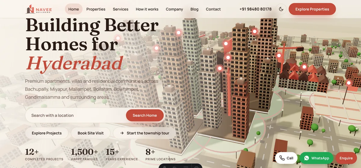
The home page opens on a 3D township you scroll over, with a location search box and "Book Site Visit" beside it. Twelve properties each have a detail page, and cards show the type, size, handover status and price, with sale and rent tags. A browse-by-type section splits apartments, villas, open plots and row houses, and there are day and dusk themes. On a phone a bottom bar offers call, WhatsApp and enquire. Open the Navee Builders demo.
Elevo Interiors: a home walked room by room
Scrolling walks you through a 3D home with six rooms, living room, modular kitchen, dining and balcony, master bedroom, kids' room and home office, with most rooms tied to the service behind them. Underneath sit six service pages, four project pages, six area landing pages, a pricing page and a budget estimator, with "Book a free site visit" kept in view. The pricing section shows starting estimates beside a note that they vary with design and materials, a good pattern to copy. Open the Elevo Interiors demo.
Aerivane Residences: luxury listings with a shortlist
A skyline climbs as you scroll, the roof opens and a hidden sky residence rises. Beneath the story are filterable sample residences, a floor plan explorer, a sun-and-views tool, amenities, a neighbourhood map, a gallery, a payment calculator and separate site-visit and enquiry pages. The page states that residences, prices and forms are sample content for a fictional developer. Open the Aerivane Residences demo.
Nookwright: furniture and kitchens you can restyle
A 3D room changes cover, wood and wall as you choose, and the whole scene follows. Shop pages let you turn each piece in 3D, a kitchen planner lays out L-shape, U-shape and island kitchens on a grid, and wardrobe, room-fit and EMI tools sit alongside a delivery timeline and a "book a call" page. It is fictional, with sample prices and nothing to order. Open the Nookwright demo.
From idea to launch: how a property website comes together
- Define the goal. Choose the one action that matters most: a site visit, a callback or a design consultation.
- Choose the page map. Use the table above and cut it to what you have real content for.
- Collect content. Photographs, plans, project details and prices, plus your sector's required disclaimers.
- Review the design on a phone. Approve the phone layout first, then the desktop one.
- Build and connect forms. Test every form, call button and WhatsApp link, and decide who receives each lead.
- Test and launch. Check pages at several screen widths, check speed on a modest phone, then publish and submit the site for indexing.
On timing: a focused website can go live in as little as 7 days. What moves it is the number of pages, the features such as calculators or filters, integrations, and how quickly your content arrives. A site with a dozen project pages and a 3D scene needs more time than a five-page brochure. The build price starts from ₹8,888 in India and US$99 internationally, and the final price depends on scope; domain and hosting are billed separately and stay in your name. See the pricing page for what drives the cost.
How to start
If you want a site for a development, a brokerage or an interiors studio, begin with the demos above and note what you want to copy. Then read about our website development service, check the pricing, and tell us about your project to get a scoped, fixed-price proposal. Browse every sector in the demo websites library.
Try it live
Open the real thing: demos run in a new tab with sample data, apps link to their own page.
 Live demoNavee Builders demoA 3D township, twelve property pages and a site-visit button, built as a concept site for a Hyderabad developer.
 Live demoElevo Interiors demoWalk a 3D home room by room, then open service pages, projects and a budget estimator.
 Live demoAerivane Residences demoA skyline reveal with filterable sample residences, a shortlist and a payment calculator.
- ABrowse allAll demo websitesBrowse working demo sites for thirty-six sample businesses.
- PBrowse allPricingWhat a website costs and what moves the price.
- TBrowse allTalk about your siteTell us about your project and get a scoped, fixed-price proposal.
Frequently asked questions
01What pages does a real estate website need?
At minimum: a home page, a listings or projects page with filters, a detail page for each project, an about and process page, and a contact or site-visit page with tap-to-call and WhatsApp. Add area pages and a calculator once the core pages have real content.
02Should an interior design website show prices?
Showing starting ranges usually helps, because it filters out mismatched enquiries and builds trust. Say plainly what the range depends on, such as design, materials and site conditions, and link to an estimator so visitors can explore their own budget.
03Is a 3D property website a good idea?
It can be, when the 3D explains something, like how a township is laid out or how rooms connect. Keep listings, prices and forms in ordinary text, test on a modest phone and respect reduced-motion settings so the site still works for everyone.
04How long does it take to build a property website?
A focused site can go live in as little as 7 days. The timeline grows with the number of pages, features such as filters and calculators, integrations, and how fast you supply photographs, plans and pricing. Zenocta confirms the timeline in a written proposal.
05Do I need to display registration or legal details on listings?
Many places have rules about what property ads and listings must show, and they change over time. Check the current rules for your area and ask your legal or compliance adviser, then give the website team the exact wording to publish.